This Is How To Pull Off Leopard Print Decor
By
9 months ago
Animal patterns that really hit the spot
Leopard print interiors are trending (again), with searches on Pinterest up by 35 percent, and 5.7 million uploads on TikTok for leopard print decor. There’s nothing new about this staple of fashion and design, but with the print trending again for summer 2024, there are endless possibilities to work this wild cat colouring into your home, from maximalist statement print clashes, to using leopard as a neutral base. Leopard print interiors as a neutral? Yes, really. Here’s how.
The Legacy Of Leopard
Leopard print’s origins in home decor can be traced back to the early 20th century when Elsie de Wolfe used it at Villa Trianon in Versailles. Her use of leopard print cushions on Louis XVI style banquettes was revolutionary at the time and set the bar for incorporating animal prints into luxe interiors. Christian Dior was the first fashion designer to feature the print (not fur) on the catwalk in 1947, saying at the time: ‘If you are fair and sweet, don’t wear it.’ The print fell out of favour in the 70s when mass production saw the spotted print popping up everywhere, losing its rare luxury appeal. It became a cool cat again in the 90s and 00s with style icons from Debbie Harry to Kate Moss to Alexa Chung giving it back its appeal.
Leopard Print At Home
Leopard is the perfect pick for this year’s maximalist movement and whimsical interiors trend. Interior designer Matthew Williamson says: ‘I love experimenting with colour and pattern, and I am a firm believer that these elements bring life and character to a space. Pattern drenching is a joyful way of elevating your interior and mixing prints that you’re drawn to.’ So you could go for a more-is-more floor-to-ceiling leopard home, or start small with accents like cushions or art work as accent pieces. As well as Williamson, who is a fan of using leopard print in bold, bright colours, Dolce & Gabbana are devotees to the wild cat in their fashion and home decor collections.
@stefficampbell_ Dolce & Gabbana Leopard Print Interiors 🐆 #dolcegabbana #dolcegabbanamilano #leopard #leopardprint #leopardprinteverything #interior #interiors #interiordesign #interiordecor ♬ sonido original – Dҽყʋιԃ Sɱ
Is Leopard Print Too Much, Though?
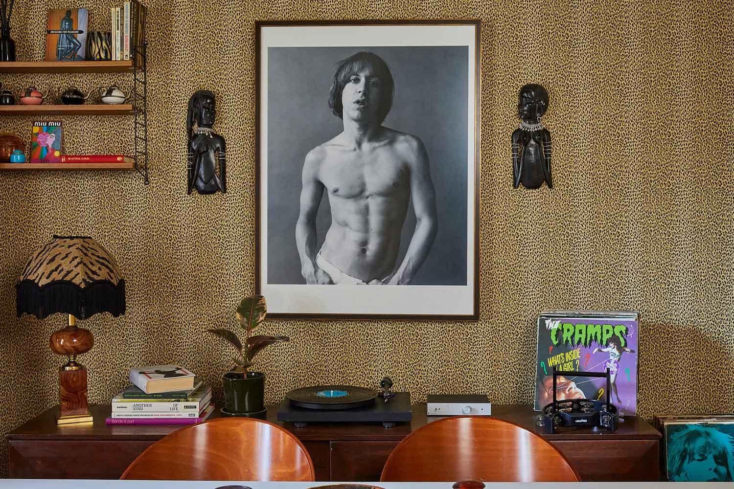
While it’s often seen as a bold, statement style, some fans of leopard actually think it makes for a great neutral base in the home. The warm browns and tan hues in classic leopard print make for an earthy colour palette, meaning the pattern can be the purr-fect base for flooring or walls. Start small with a rug, or create a fun centre-piece to the home with leopard carpeted stairs.
We spoke to Chloe Vince, Decorating Consultancy Sales Executive at House of Hackney (the masters of leopard print), to get their take on the trend. Here’s what she told us:
Leopard print comes and goes: how are people using it in their homes now?
Here at House of Hackney, Madeleine Castaing is a big inspiration for us and is the reason we regard leopard print as timeless in interiors. The combination of butterscotch tones provide the perfect neutral base to build your scheme upon. We are seeing people looking to leopard print for flooring, in particular our Axminster carpet. We pride ourselves on creating future heirlooms – and our Axminster collection is made to last. It is the perfect option for a transitional room and provides that unexpected element of tongue in cheek – something many of our clients look for in their interiors.
What’s your take on it?
Here at House of Hackney we consider our leopard print, Wild Card, to be a staple when working on a scheme. We work with mother nature’s colour palette throughout our collections therefore the earthy butterscotch tones used in Wild Card are the perfect addition to any scheme and help to unify different prints when pattern clashing or colour drenching.
Best way to dip your toe in the trend?
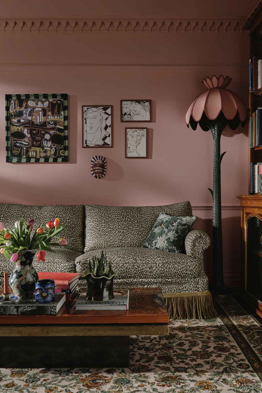
For a playful twist on traditional furniture our Wild Card Wilton Sofa is the perfect addition to any scheme. The print helps to unify any scheme as well as being a playful accent. The combination of Artemis and Wild Card will provide you with a great base for your scheme and with this you can decide whether to be bold and brave with paint or opt for a complimentary neutral for a most restful scheme. Cosmos is a great option for mid tone paint colour with its earthy brown and warm pink undertones helping to create the perfect cosy lounge scheme.
Or how do you go all out with this?
We encourage people to throw the design rule book out of the window and to be bold and brave with their interiors. Therefore, there is no right and wrong when it comes to colour pairings and print drenching. One of my favourite pairing currently would be Umber from our Art of Nature paint range. These deep mustard hues make it the perfect complimentary colour for our Wild Card wallpaper bringing dark and alluring golden tones into the interior. Our Wild Card print is available across all of our product categories so you can be as daring as you wish. Whether it be our Wild Card carpet or our lampshades, all are a great addition to any scheme and here at House of Hackney our complimentary Decorating Consultations can help you every step of the way.


