Here’s How To Make Your Home Look Like A Luxury Hotel Suite
By
9 months ago
Jacu Strauss takes us inside the picture-perfect new suites at Pulitzer Amsterdam
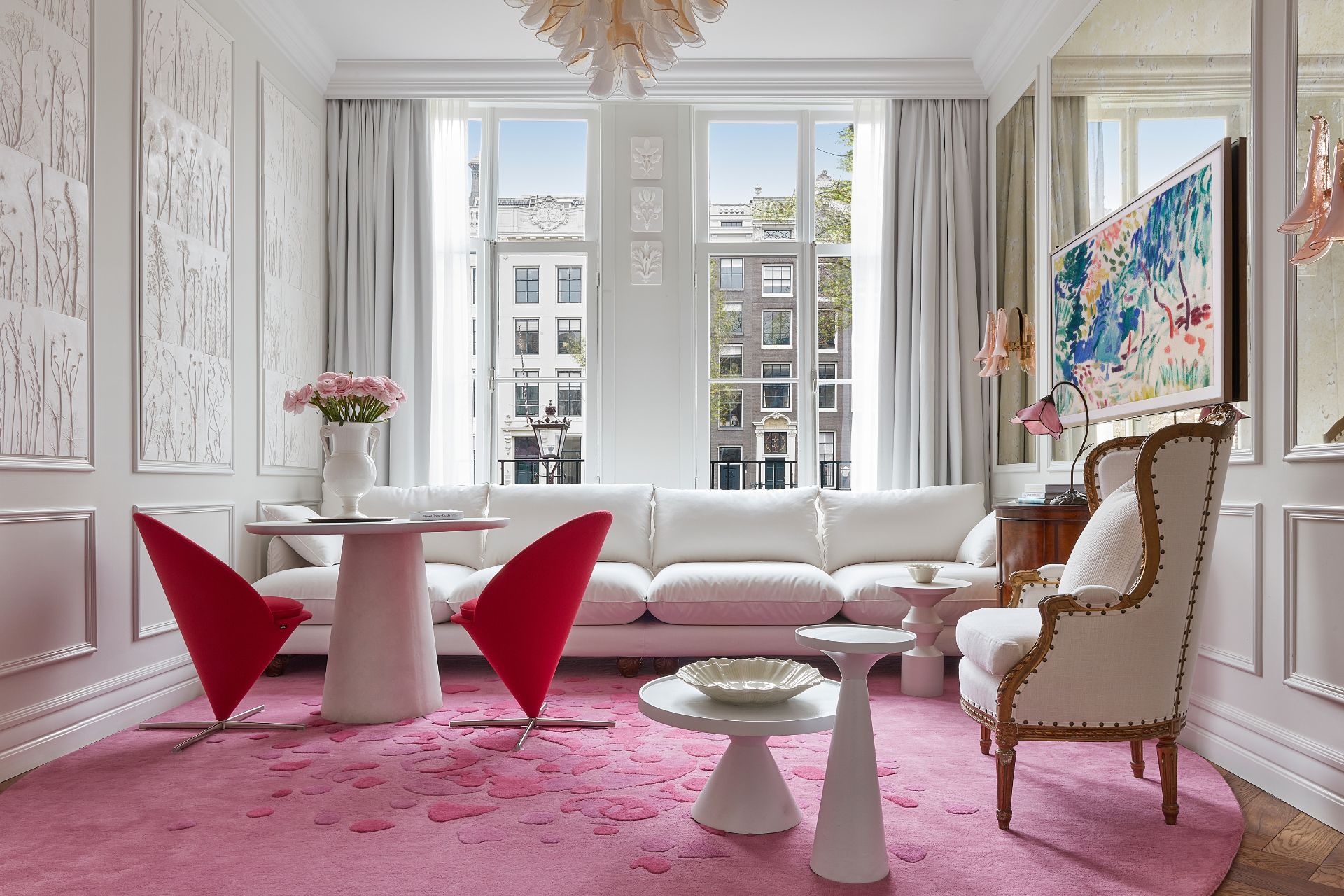
Think of Amsterdam and you’ll likely think of tulips – and Van Gogh. The brand new suites at Pulitzer Amsterdam celebrate the city’s rich heritage, with the gorgeously romantic Flower Collector’s Suite tying together traditional Dutch design with botanical elements to create a floral haven. We caught up with the hotel’s designer, Jacu Strauss, to chat about his vision for the space (and how you can get the look at home).
Jacu Strauss On Pulitzer Amsterdam’s New Suites
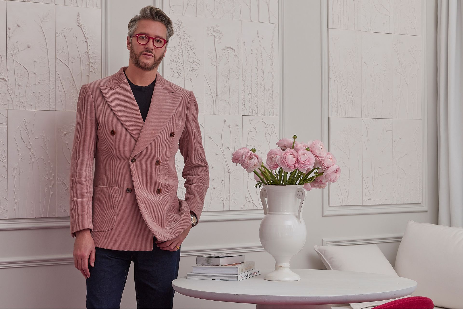
Hi Jacu! Can you tell us about the background of the Pulitzer Amsterdam project?
Pulitzer Amsterdam is such a historic setting – we wanted the Flower Collector’s Suite to be an homage to the city’s longstanding history of flower trading. We revealed the suite this May, just in time for tulip season.
What was the brief?
I wanted to represent the city’s celebration and love of flowers, both historically and today. Featuring a spacious and impressive hallway entrance, a double bedroom, an elegant walk-through bathroom filled with D.S. and Durga amenities, plus an expansive, separate living space with freshly arranged tulips, the suite is the perfect space to enjoy canal-side views with floods of natural light from the floor-to-ceiling window.
Talk us through your early inspiration for the project.
The two-room suite reimagines a 19th-century tulip-trader’s home; blending traditional Dutch designs, horticultural artwork, and bespoke furniture.
What was your vision for the bedroom?
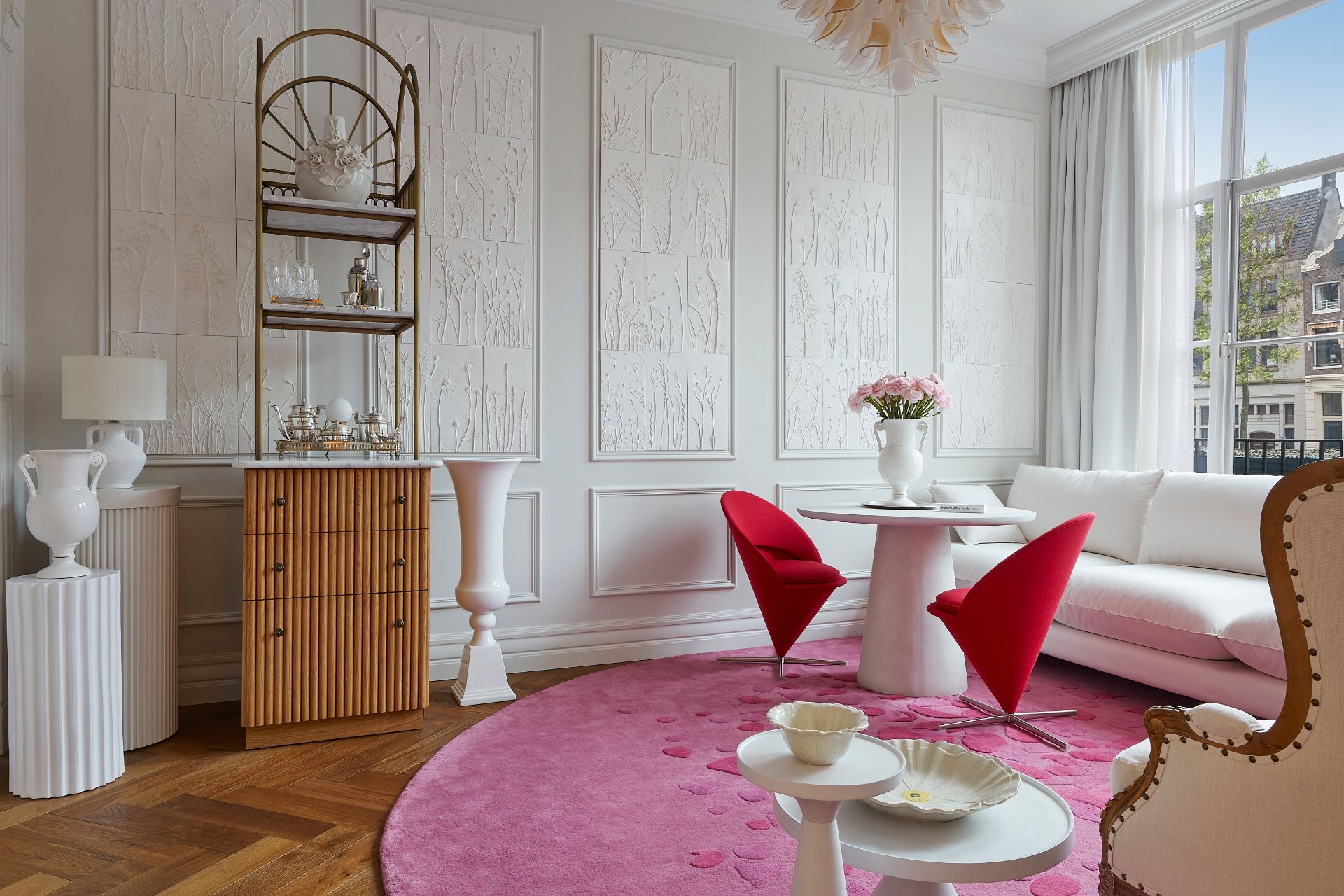
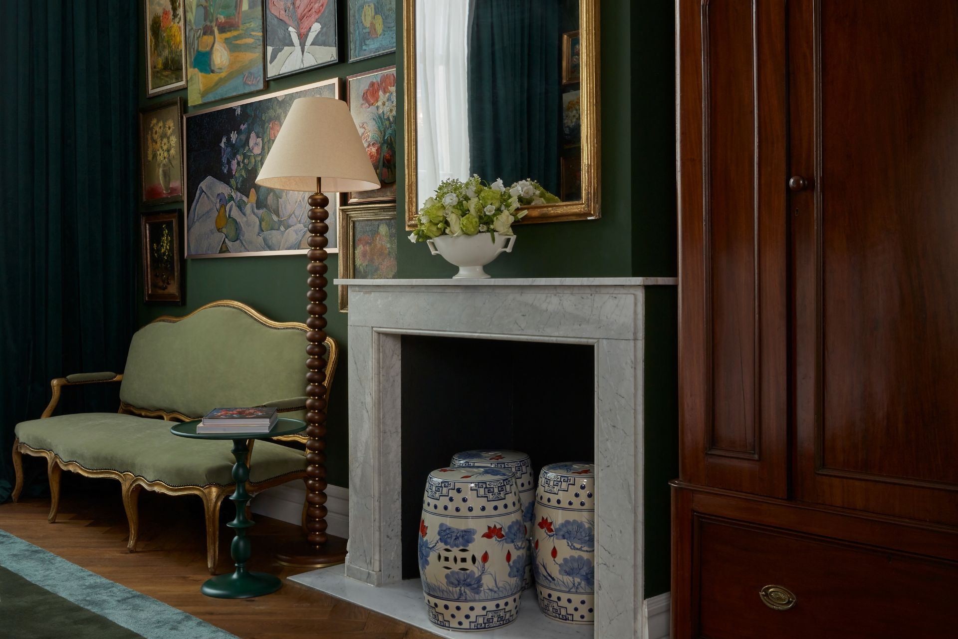
I love balancing contrasting elements, and I aimed to showcase this in the Flower Collector Suite in two very different ways. The bedroom feels more traditional, with a vast collection of collected paintings along a palette of velvety dark green, a custom bed with hand sculpted tulips on the headboard, and antiques including the Carlton House desk and Louis XIV-style sofa and chair. The bedroom is a juxtaposition of the light living space opposite, with columns of framed flower paintings on the deep green walls. I was inspired by an arrangement in the Royal Academy during the late Victorian era.
How about the living room?
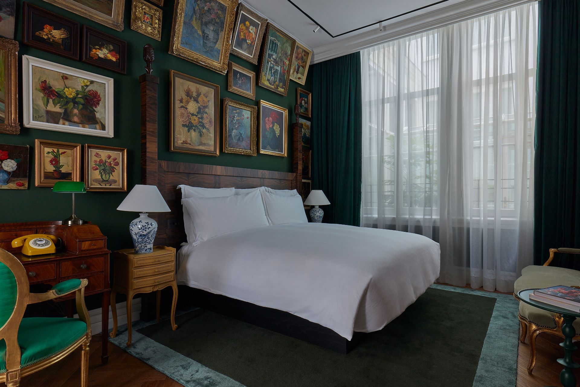
In contrast to the bedroom, the living room is all about texture and bold single colours in a very bright and white interior. The rug and Verner Panton cone chairs add a pop of contemporary colour and form to the room, too. The living room incorporates nods to the art of floristry throughout; the bright pink rug is an ode to fallen petals, the mini bar showcases metalwork inspired by the greenhouses at the Dutch botanical gardens, and exclusive hand-pressed floral titles have been created by an artisan in France – and each one of the 60 is unique.
What materials did you particularly work with and why?
In the living room: white flower imprint tiles especially handcrafted by UNIQUEKR8IVITY in France – these feature incredible details when you look closely, and discreet track lights by FLOS make the tiles on the wall come to life even more. We also went for oak herringbone floors from Havwoods and Farrow and Ball paints to give the white a chalky quality.
In the bedroom, we opted for Farrow and Ball deep green paint to create a velvety texture, and we added some vintage pieces to tie in with the heritage and collection of the Pulitzer as a whole.
Were there any challenges on the project? How did you work around these?
Challenges are not always a bad thing; having an intricate project means you have to find creative solutions. Some of our hotels come with a lot of historic preservation red tape. The Pulitzer, for example, is made up of a collection of 25 golden-age houses, some over 400 years old, set within a UNESCO world heritage building. Because we don’t have a cookie-cutter approach, we were able to embrace the quirks of the building and celebrate the way the property has aged, rather than plastering over years of history. The Pulitzer’s complexity also meant that none of the rooms or suites are the same, so we had to put a lot of effort into the overall design to allow each room to feel like it was designed individually. That was hard work, but it certainly paid off.
Were there any sustainability considerations in the project?
I collected the art for the suite over a year from various sources, markets, auctions, and some even from online platforms like Etsy seller and ArtVanHolland in the Netherlands, which started buying and selling the odd antique painting to overcome hard times and now sells hundreds of artworks online. I love how each painting must have meant something special to the artist and we are now happy custodians of them at the Pulitzer.
What’s your favourite part about the suite?
I was particularly happy with the handmade flower imprint tiles by “UNIQUEKR8IVITY” which cover an entire wall in a subtle way, with mesmerising details up close.
To celebrate the suites, we collaborated with European designer Zoe de Givenchy, who has created a bespoke flower-inspired tableware collection.
How could readers recreate this at home?
My advice for achieving a similar look is to set yourself a clear brief, and then stick to it. In the case of the Flower Collector Suite, the mission was to find mostly framed floral pieces in oil paint and in various sizes. I also looked at art with various states of wear and tear, but when grouped together the odd chipped frame or scratch did not matter because of the greater collective effect of hanging them together. I also angled the top layer to add drama and highlight the almost compulsive collector nature of all the pieces in one room.
I think the trickiest part is to plan the layout. A practical tip is to lay the pieces out on the floor together before hanging them, and find some balance alternating small and large, landscape and portrait. And don’t hang them too far apart. The idea is that it should almost feel a bit crowded. Think ‘cluster’ rather than ‘spread out’, regardless of whether you’re hanging two or three or 73 paintings.
For more information about the new suites at Pulitzer Amsterdam, visit pulitzeramsterdam.com

