London’s Most Aesthetic Restaurant Interiors
By
1 year ago
Feast Your Eyes
Care more about décor than dining? Who’s to blame you with the dazzling array of London’s aesthetic restaurant interiors. It also just so happens these restaurants serve food that’s an equal feast for the eyes.
There are two people in this world: those who look up the menu beforehand, and those that look up the aesthetics of the interiors on Google images. If you’re reading this, you’re almost certainly in the latter camp. And as you should, what’s good food without a suitably beautiful interior to pair it with?
What Are London’s Prettiest Restaurant Interiors?
- Bacchanalia, Mayfair
- Bar Douro, Finsbury Avenue Square
- Tattu, Tottenham Court Road
- Sessions Art Club, Clerkenwell
- Sketch, Mayfair
- The Red Room, Connaught
- Beaverbrook Town House, Chelsea
- Ave Mario, Covent Garden
- Ottolenghi, Chelsea
- Maison Francois, St James’
- Silo, Hackney Wick
- Spring, Covent Garden
- Isabel, Mayfair
Here’s the low down on London’s aesthetic restaurant interiors.
London’s Most Aesthetic Restaurant Interiors
Bacchanalia, Mayfair
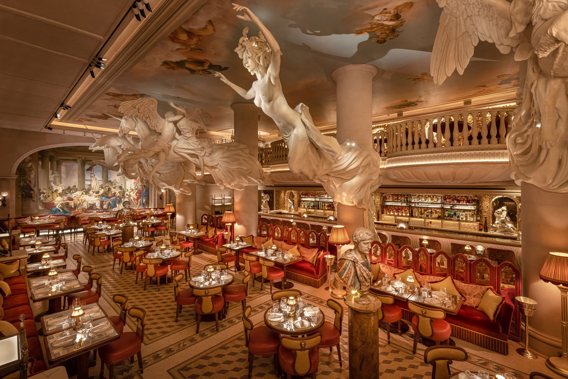
One of 2022’s buzziest openings, we’re still not tired of looking at Bacchanalia’s stunning interiors. It has Richard Caring at the helm, the name behind some of London’s most glamorous clubs and restaurants, including Annabel’s just down the road, with interiors by Martin Brudnizki. Inside, you’ll find whimsy and wonder, with a blend of ancient and modern worlds, toga-wearing waiters and a more-is-more aesthetic. Artwork is also a blend of old and new, with marble sculptures by Damien Hirst above diners depicting unicorns, Medusa and Bacchus, and a winged lion, sitting alongside 2,000-year-old statues to gaze upon while you eat.
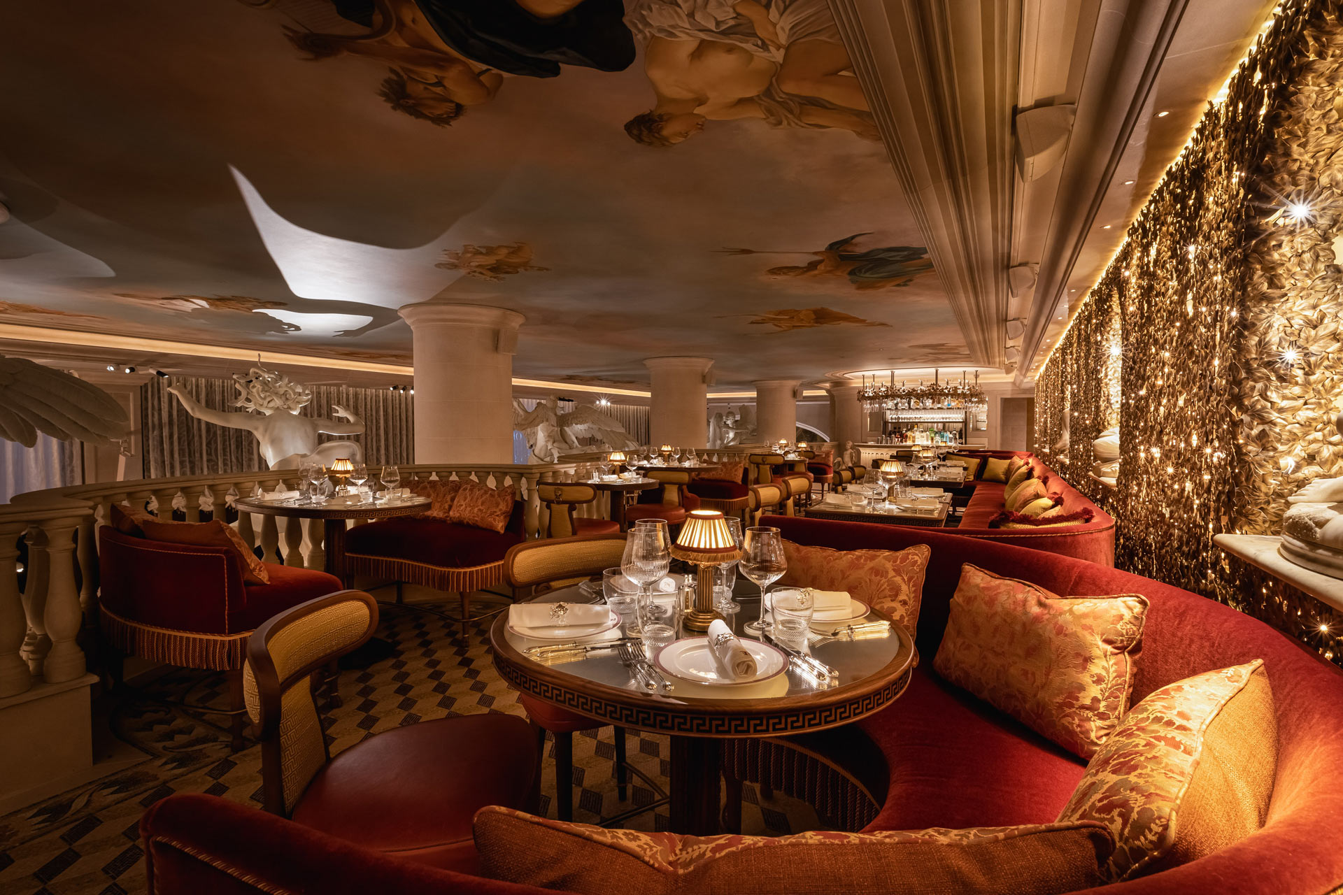
Johnny Stephens Photography
Walls feature floor-to-ceiling murals by Gary Myatt, with a modern twist on Thomas Couture’s 1847 painting Romance in their Decadence and the women’s loos are perhaps the most impressive space of all, telling the story of the Garden of Hesperides, the orchard of Greek god Hera. Read our full review of Bacchanalia here.
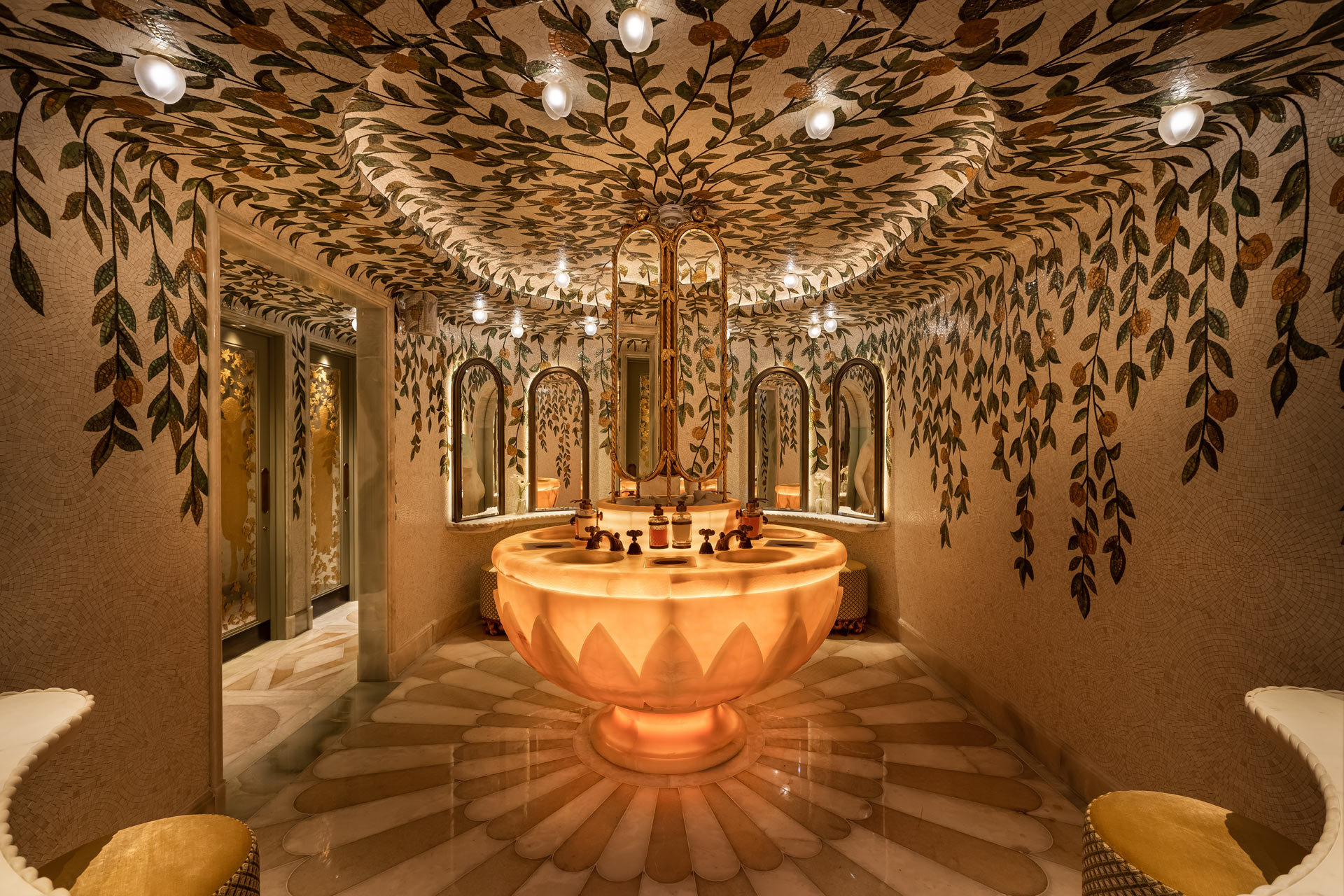
Johnny Stephens Photography
Bar Douro, Finsbury Avenue Square
You might only be moments from London Liverpool Street, but on entering Bar Douro, you’ll find yourself transported over 800 miles away to Iberian Peninsula. This Portuguese offering, a tapas bar with an open view into its bustling kitchen, is a veritable treat for interiors-nerds-cum-foodies.
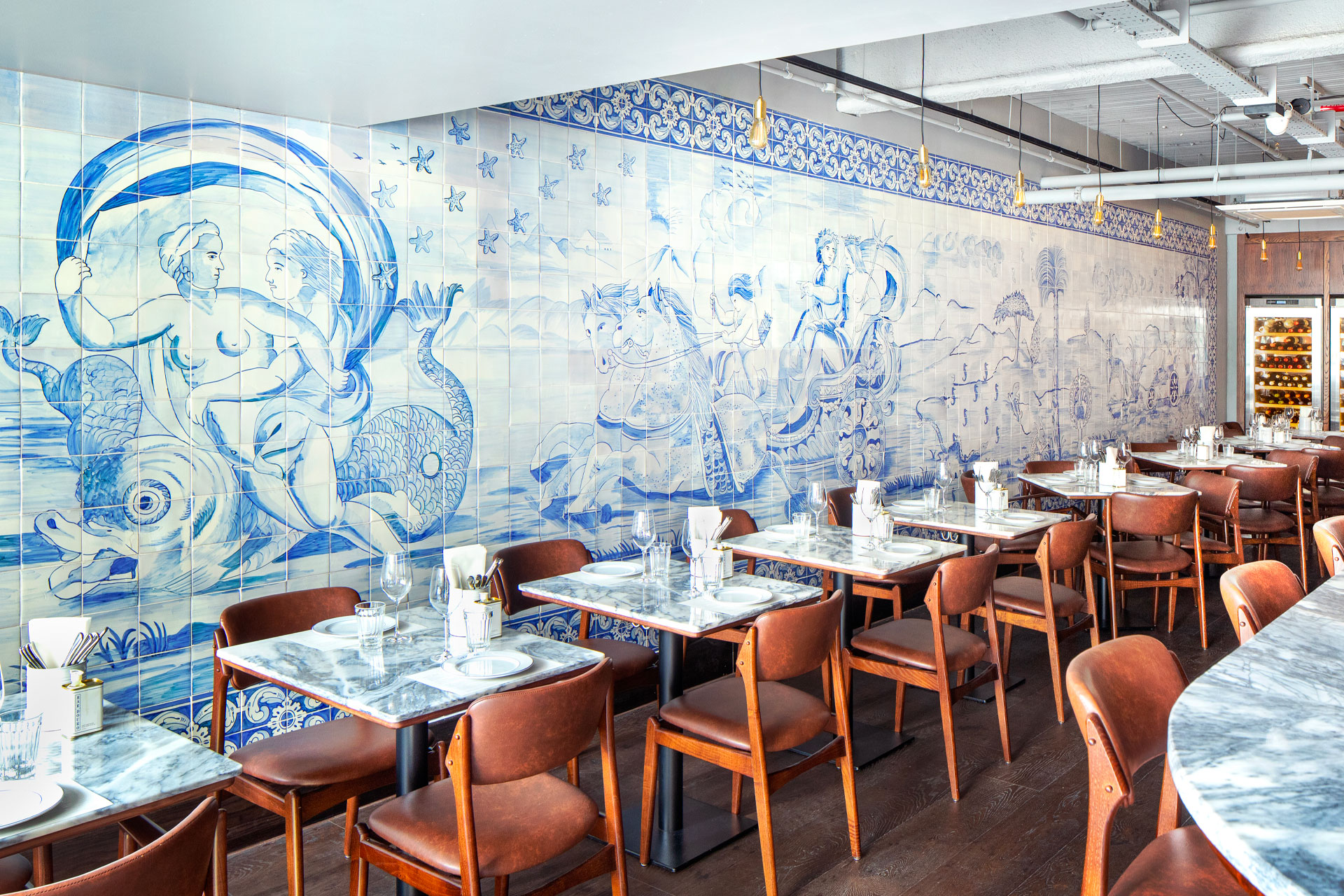
This place is all atmosphere. From the shack-like ceiling, sat low above your head, to the smart leather chairs, to fetching blue-and-white hand painted azulejos tiles (literally ‘little stones’), it communicates a lot via its interiors – with very little wasted breath. It’s almost the sort of place you accidentally ducked into one year on a family holiday, documented with a battered disposable camera. In other words, there’s a real nostalgia to the ultra-European interiors.
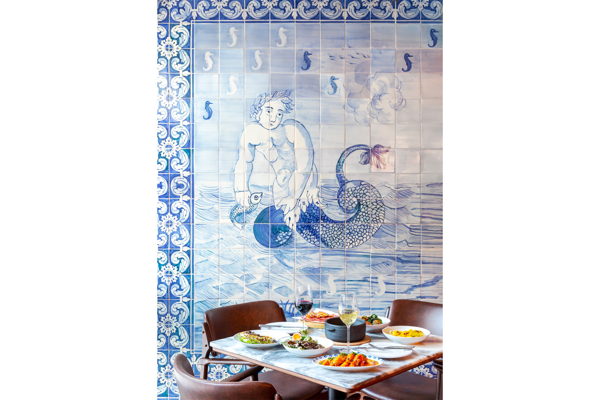
The food is as aesthetic as the space itself. Your food arrives on neat, bold type-faced plates in streams, as and when, in no particular logical order – you’re recommended to get a sharing selection – and they present a mouthwatering regional offer. From particularly punchy potatoes (bataras a murro), which are herby, buttery and smattered with green sauce, to the drowned gambas à la guilho, each of these bites are as picture-perfect as they are powerful. You’d be remiss not to try a perfectly paired wine, too, while here: founder Max Graham comes from a family of Portuguese wine producers, and the vast selection of local wines on offer are therefore expertly curated. A charming, nostalgic hideaway in Finsbury Avenue Square – with interiors fit to transport you to sunnier climates. bardouro.co.uk
Tattu, Tottenham Court Road
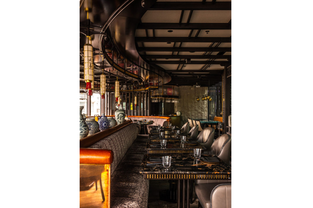
Tattu Restaurant, designed by Joyce Wang Studio. Photographer: Edmon Leong
Some restaurants stick up a painting and call it quits when it comes to interiors. But you’ll be hard pressed to find a Chinese restaurant in London that’s had more painstaking aesthetic precision than Tattu restaurant.
The interior’s concepted around recreating a traditional Chinese courtyard house; borne for the creative brains of Joyce Wang (of acclaimed Joyce Wang Studio). But of course, this isn’t just any ‘Chinese courtyard’, it’s a Joyce Wang one, so think of it instead as this ultra lux immersive aesthetic experience.
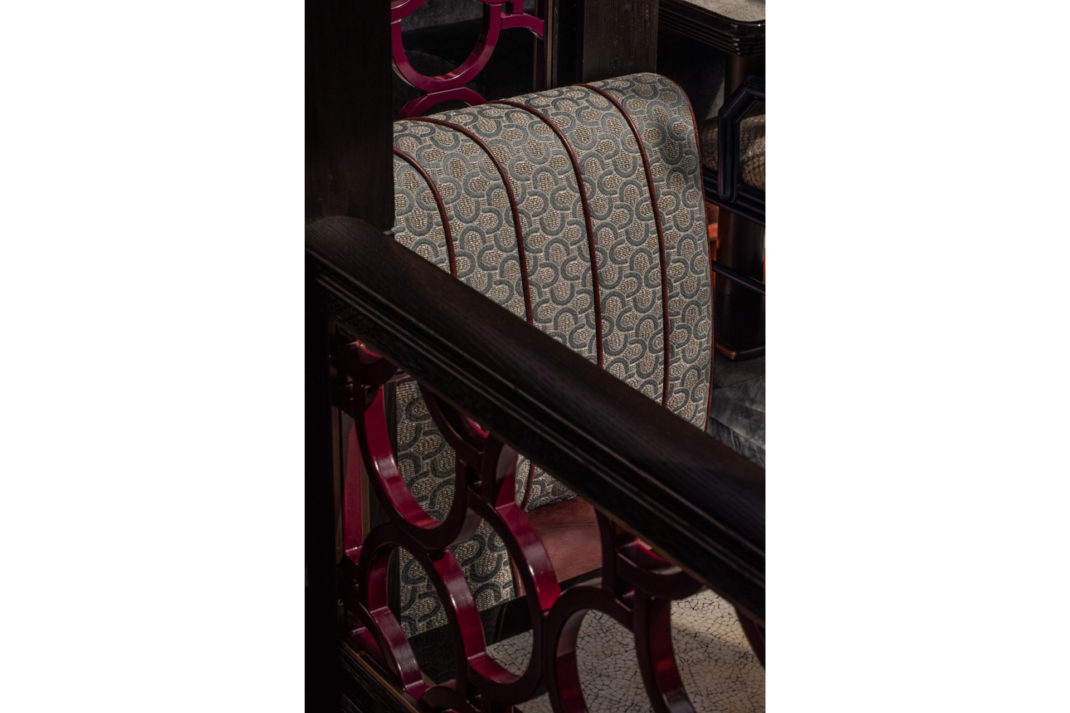
Tattu Restaurant, designed by Joyce Wang Studio. Photographer: Edmon Leong
First off, to get there you’ll need to take a swish lift from a statement minimalistic reception on ground floor. So from the get go it’s all wrapped in this bond girl mystique, that we’re certainly not complaining about.
It’s a got somewhat of a slick sultry feel to it. Subdued, soft lighting emanates from hanging lanterns plus there’s the odd pop of a glimmering light projection that’s all perforated through meticulous traditional Chinese lattice work.
There’s plenty of details at Tattu that pack an aesthetic punch. You’ll immediately clock the statement bespoke cherry blossom tree installation hanging overhead. Then of course plenty of delicious details, like the many Ming vases strewn around and leopard print seating that prowls over in another section.
And it won’t surprise you that the food’s of equal aesthetic skill. To complete the spectacle, we’d finish the night off with their signature pudding, the Cherry Blossom. You’ll see what we mean when it arrives (iPhone cameras at the ready). tattu.co.uk
Sessions Art Club, Clerkenwell
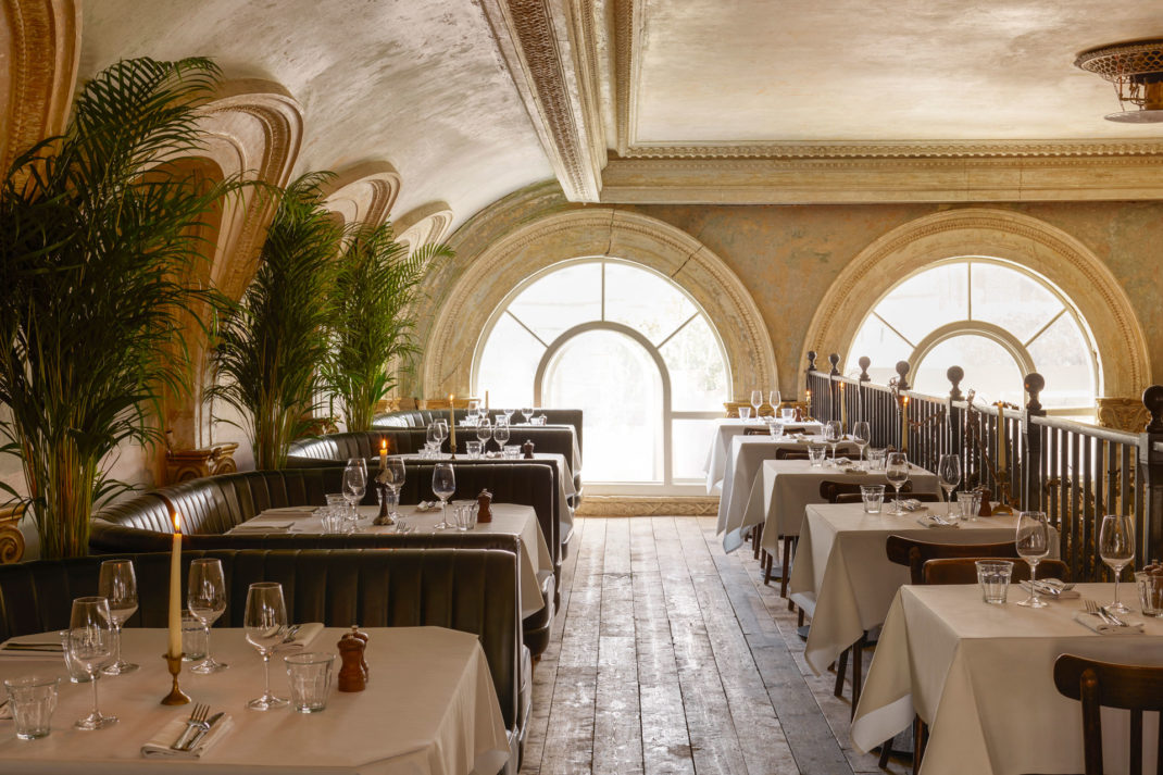
The green leather banquettes are a nod to the courthouse’s heritage. Image courtesy of Sessions Art Club
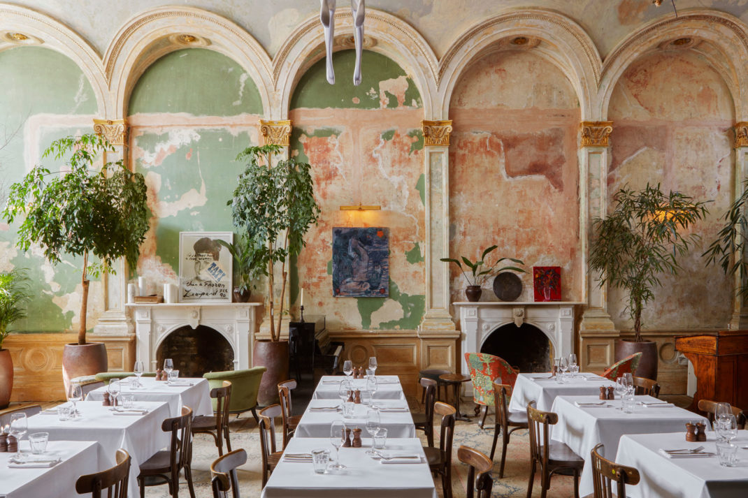
Image courtesy of Sessions Art Club
Sketch, Mayfair
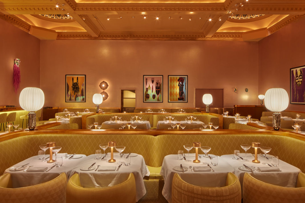
Image courtesy of Sketch
Though often fêted as London’s most Instagrammable restaurant, Sketch has an intriguingly historic past. Once the venue of both Christian Dior atelier, and HQ of the Suffragette movement (not at the same time), Sketch’s interiors have more than meets the eye than its pretty IG post reputation.
With the likes of Tracey Emin, Martin Creed, and Yinka Shonibare (among many others) displayed on the walls, Sketch can be described as an easy choice for London’s aesthetic restaurant interiors, since it’s catnip for artsy Instagrammer types.
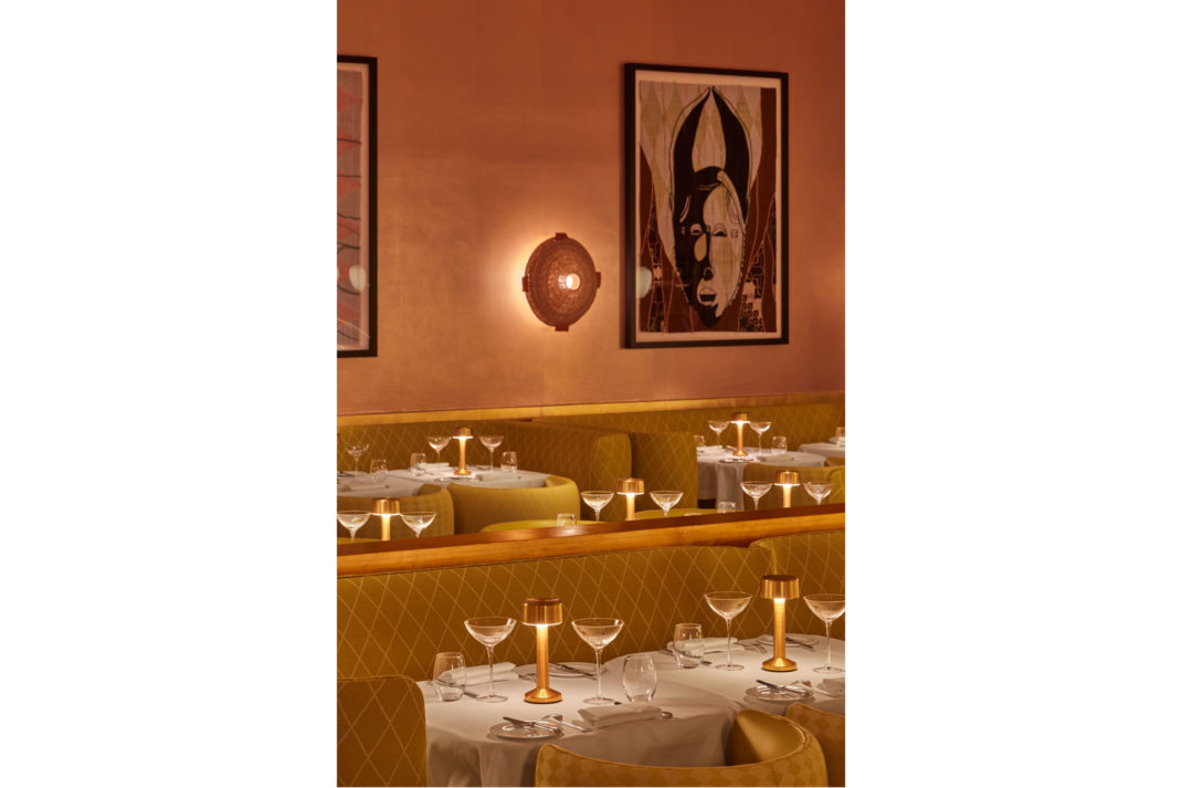
Image courtesy of Sketch
The Gallery (one of five rooms), is Sketch’s most well known. Yinka Shonibare (a British-Nigerian artist), and architect India Mahdavi reimagined their iconic pink into their now equally as iconic yellow that sent trend forecasters into a spin, declaring the hue to be the ‘it’ colour for the rest of the year. sketch.london
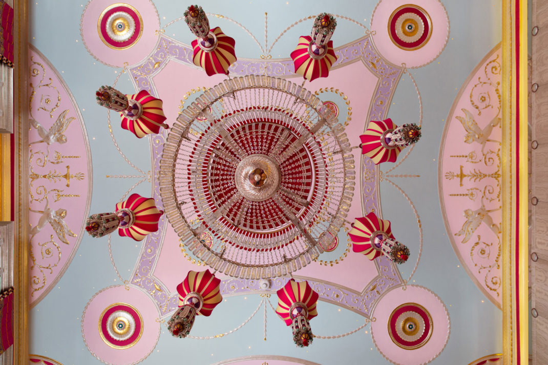
Sketch Library Ceiling View. The Library room is embellished with fabrics of magenta and silver. Image courtesy of Rob Whitrow, Sketch
The Red Room, Connaught
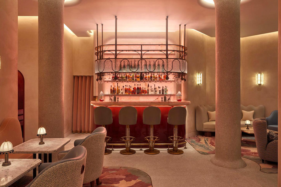
The Red Room Interiors at The Connaught. Image courtesy of The Connaught.
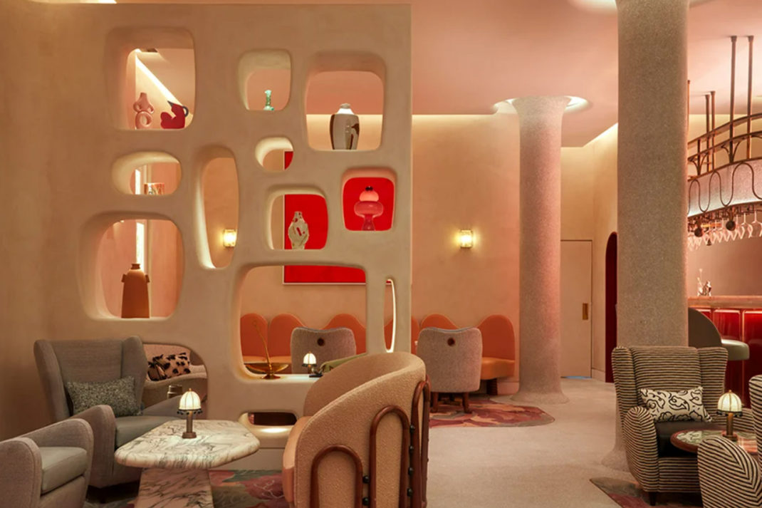
The Red Room, otherwise known as the bar that’s everyone has on their TikTok saves, is perfectly poised within The Connaught Hotel in Mayfair. The bar, of all London’s aesthetic restaurant interiors, has likely played host to the chicest of guests (Rosie Huntington Whitley launched her makeup line, Rose Inc, at The Red Room, for instance).
The Red Room, The Connaught. Image courtesy of The Connaught
Brush away a fluttery velvety red curtain to enter, and you’ll be met with an interior that’s plush with a clutch of artworks in red, all crafted by internationally acclaimed women artists (Louise Bourgeois’ ‘I am Rouge’ is the statement piece, which hasn’t ever been exhibited until now).
Expect a pink onyx bar (because, what else would you expect in this space), amongst a marbled flecked fireplace, and a smattering of beautifully perched objects d’art strewn about the place. All this was formulated by the creative mind of interior designer, Byran O’Sullivian. the-connaught.co.uk
Beaverbrook Town House, Chelsea
Sir Franks Beaverbrook Town House. Image courtesy of Beaverbrook Town House
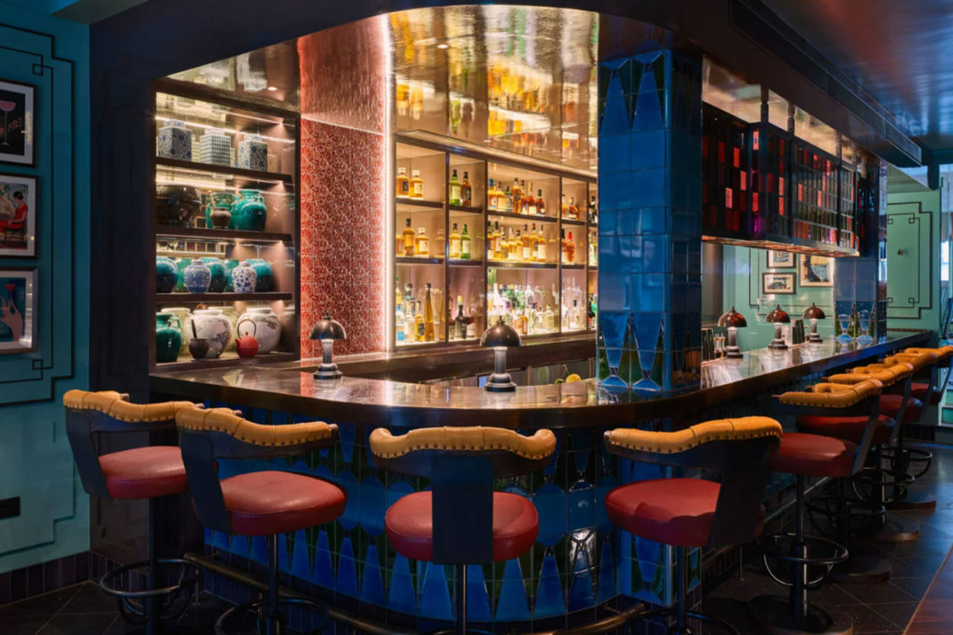
Bold, clashy, chic: dining at Beaverbrook Town House should be on anyone’s list if they’re after a bit of maximalist zing. Consider their bar, (they call it Sir Franks bar), a result of an aesthetically chaotic magpie with a penchant for 19th Century woodblock prints. Of all London restaurant interiors, Beaverbrook Town House is maybe the most surprising for its cacophony of colour, from its unassuming brick façade.
Review: Omakase at Beaverbrook Town House, Chelsea
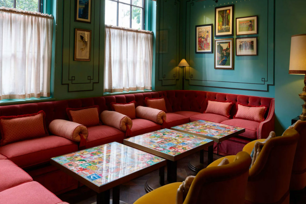
Image courtesy of Beaverbrook Townhouse
Chequered floors and plush upholstered furnishings pop against the minty Poirot-esque walls. It’s kitschy, it’s loud — but boy does it still manage to pull off the feel of effortless Bond Girl glamour. It’s all the result of the much fêted interior designer, Nicola Harding, whose Midas touch gives that feel of whimsical sumptuousness you’d be hard-pressed to find elsewhere. beaverbrooktownhouse.co.uk
Ave Mario, Covent Garden
Ave Mario Mirrored Interiors, photography by Jerome Gallant
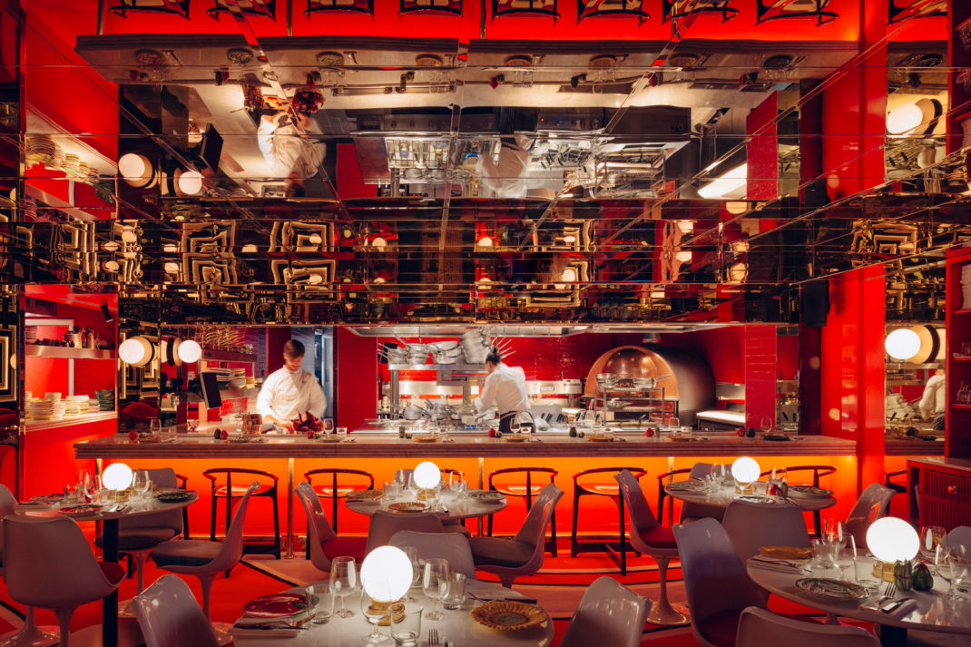
Ave Mario often does the rounds in the the most striking of restaurant spaces in London. Think Italianate church meets the bold red of an Amsterdam red light district, that meets a hall of mirrors at the circus, but in the best way possible. You certainly won’t be short of conversation when you enter Ave Mario’s mirrored halls.
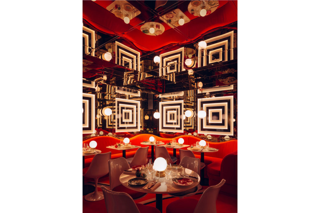
Ave Mario, Image courtesy of Jerome Galland
With a bar framed with 3,5000 bottles, psychedelic duomo-striped walls, and the red reportedly inspired by the slippers of the Pope, this isn’t for the faint-hearted nor wallflowers. Designed by their in-house team, Studio Kiki, led by Apolline Lugger, Ave Mario is for those who want to drink in the atmosphere of a chaotically chic destination as much as delve into their Italian menu. bigmamagroup.com
The Best Healthy Restaurants in London
Ottolenghi, Chelsea
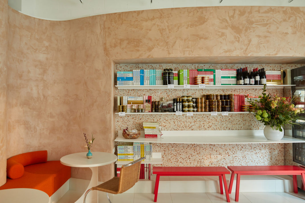
Image courtesy of Ottolenghi Chelsea
Peachy pinks, reds, and whites seem to be the colours du jour in restaurant design these days. With Ottolenghi’s fifth deli iteration in Chelsea, think: gently curved walls of pastel-orange brush strokes, a floor of plaster and crushed recycled bricks, all designed by Alex Meitlis, long-time Ottolenghi collaborator. Out of all London restaurant interiors, this one’s for the minimalists among you who love a brush of colour. ottolenghi.co.uk
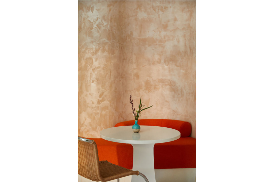
Image courtesy of Ottolenghi Chelsea
Maison Francois, St James’
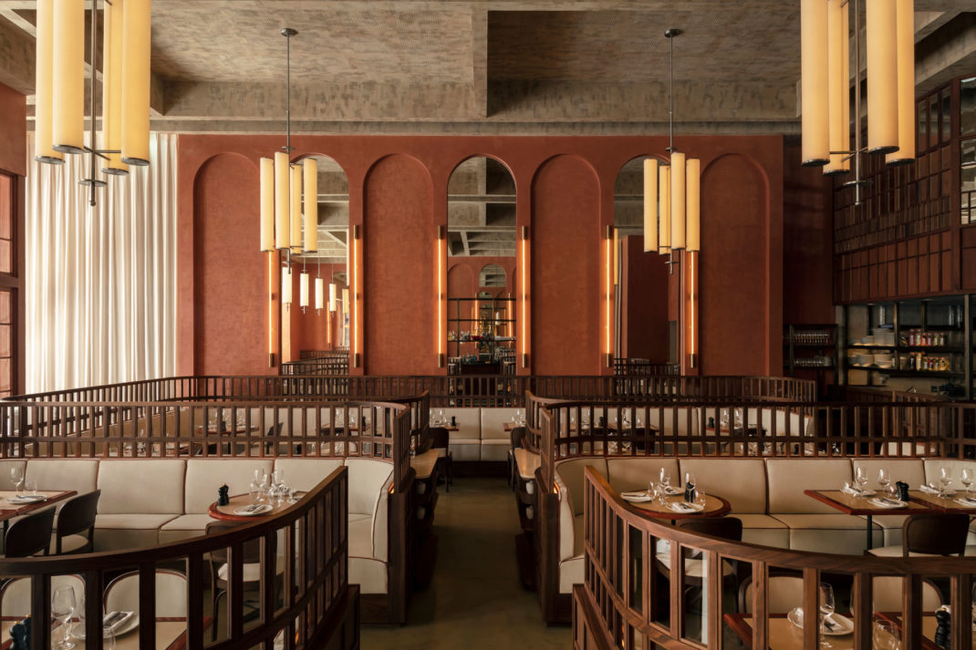
Image courtesy of Maison Francois
Taking cue from Ricardo Bofill’s architecture (known for its bold colourful, rectilinear urban design), this brasserie, Maison Francois, designed by John Whelan, is all about bold arches, terracotta stuccoed walls, and a wooden-lattice structures to cocoon in the clientele.
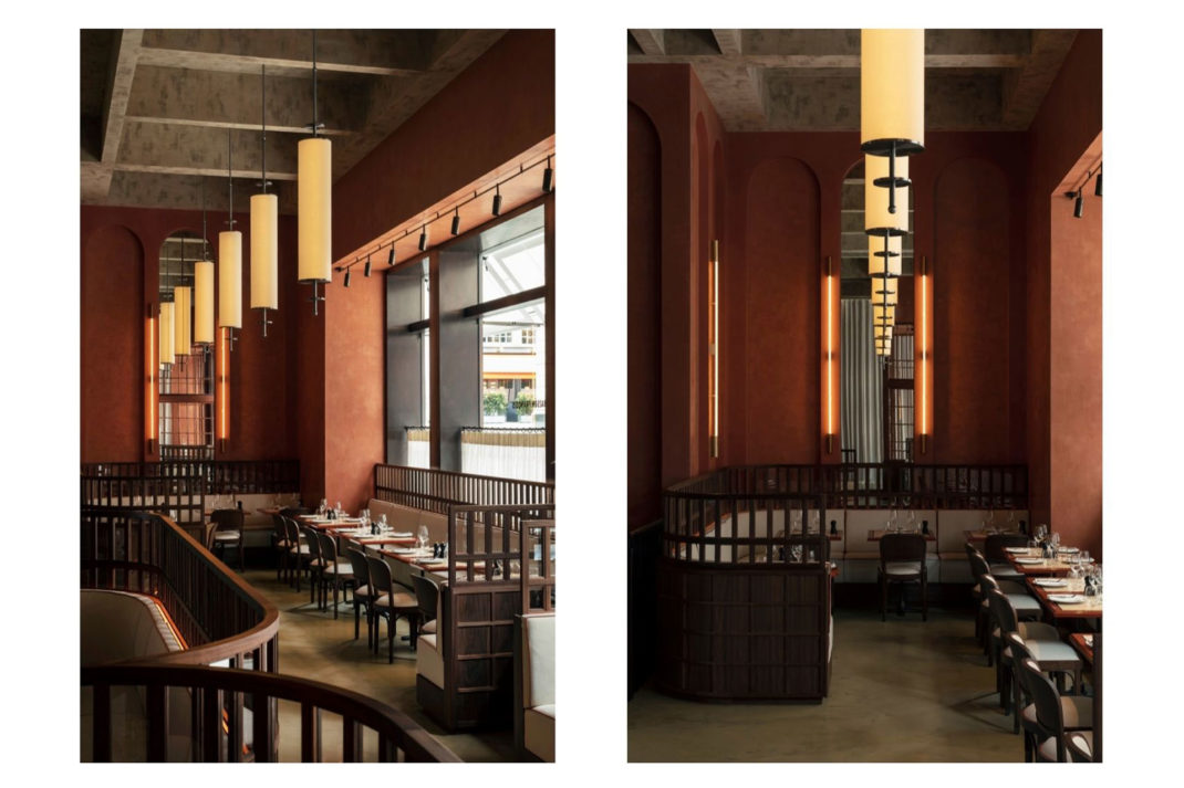
Image courtesy of Maison Francois
Minimalism is king at Maison Francois: see cylindrical chandeliers and lacquered floors. It’s a delight for anyone who’s into precision, Wes Anderson, and restaurant interiors that pack an architectural punch. maisonfrancois.london
How to Get The Wes Anderson Look
Silo, Hackney Wick
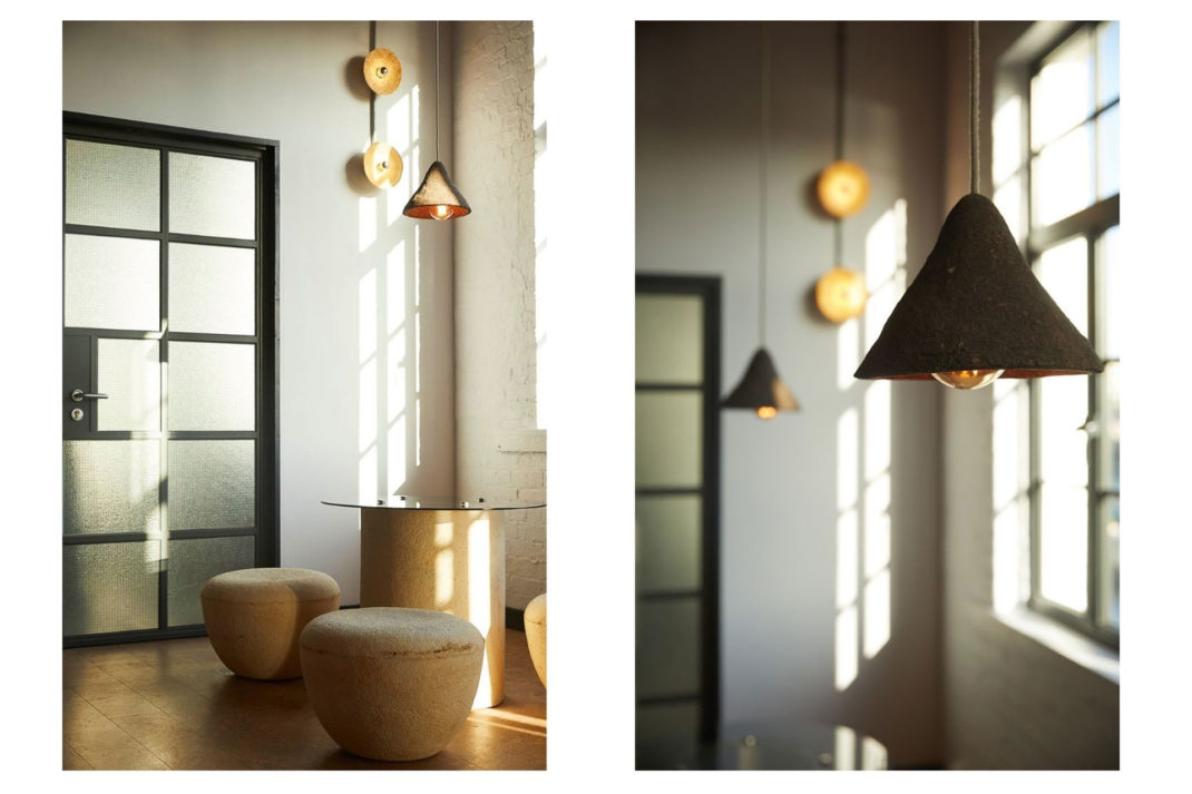
Image courtesy of Silo
Considering it’s tipped as the world’s first zero-waste restaurant, it’s only natural a green ethos would spin into the design of Silo. The furnishings and fittings are created from a desire to re-use, choosing upcycling before recycling.
The table tops, for example, are made from upcycled Smile Plastic, the bar front from recycled leather, and the wall lights crafted from crushed wine bottles. All products delivered to the restaurant come in re-useable crates, pails, urns or containers. silolondon.com
Spring, Covent Garden
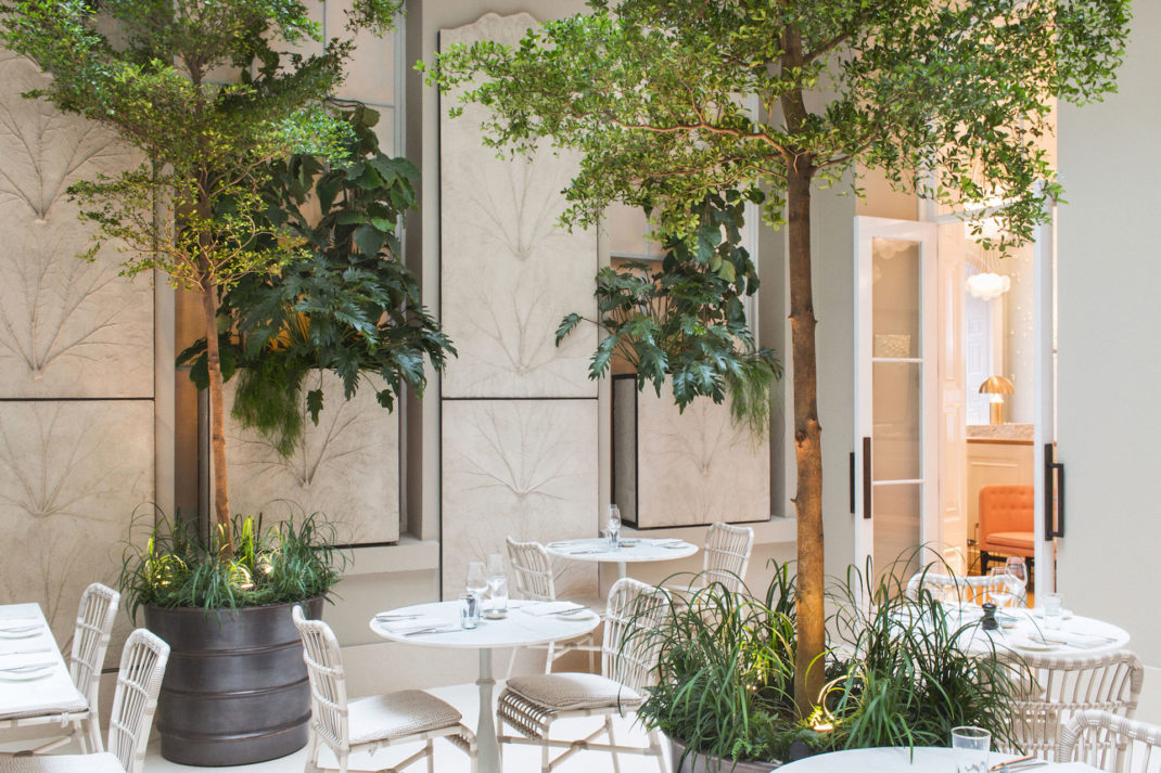
Spring Restaurant, Image courtesy of Amber Rowlands
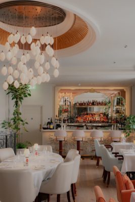
Blonde wood and blush-toned fabrics, gauze hangings and cloud-like chandeliers are just some of the things you can expect at Somerset House’s restaurant, Spring. Brimmed with almost trees peppered amongst the tables to give an intimate feel, expect also Spring’s signature art installation, of white porcelain petals fluttering down its walls, by a female artist, Valeria Nascimento.
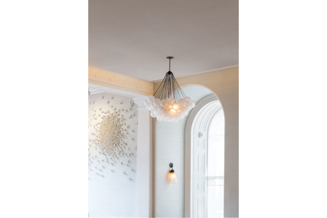
White porcelain petals fluttering down its walls, is by female artist, Valeria Nascimento. Image courtesy of Spring
Although the room itself, within the majestic precincts of Somerset House, is loftily impressive, it’s far from overwhelming. Walking in, you’ll be intrigued that the small groupings of tables offer a surprising amount of privacy in a high-ceilinged space. springrestaurant.co.uk
Isabel, Mayfair
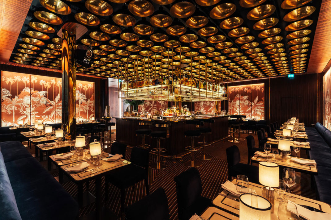
Isabel Mayfair. Image courtesy by Haydon Perrior
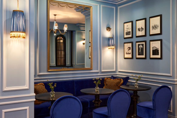
Inspired by the hedonism and bright lights of the 1930s, Isabel Mayfair is all about the spectacle of light. The glitzy Art Deco space is the result of designer, Juan Santa Cruz, where it’s best described as a kind of wood-clad-club that upholstered with decadent Napoleonic blue seating. Isabel Mayfair has welcomed a clutch of star studded clientele (Sienna Miller, Robert Pattison, Noel Gallagher, to name a few). isabelsw1.london
Main Image courtesy of Bacchanalia

