Changing (Hotel) Rooms: Laurence Llewelyn-Bowen’s Maximalist Hotel Redesign
By
2 years ago
The TV star and interior designer transformed The Dial House Hotel
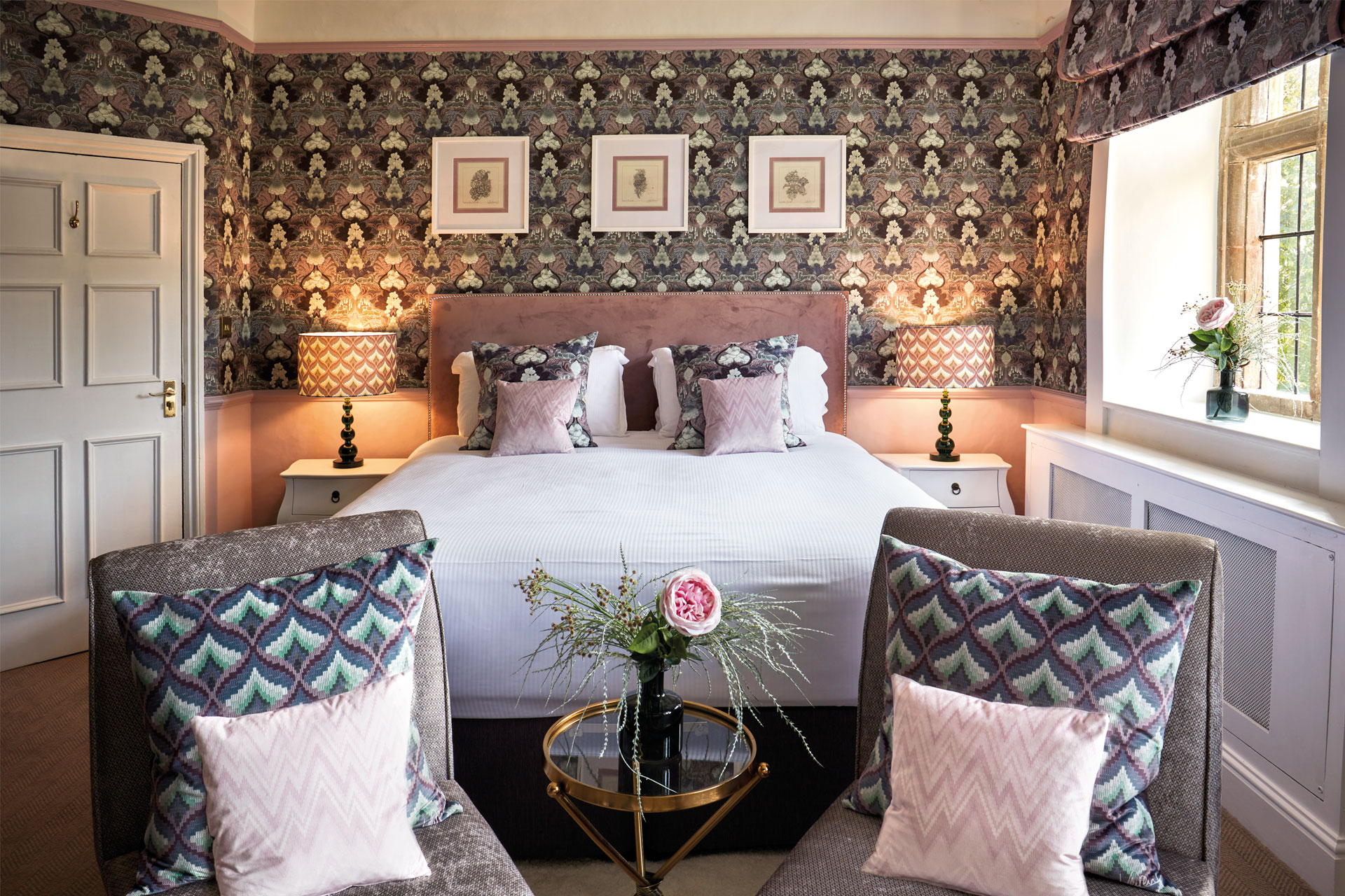
Laurence Llewelyn-Bowen’s maximalist touch breathes life into The Dial House in the Cotswolds, says Tessa Dunthorne.
Laurence Llewelyn-Bowen’s Maximalist Redesign Of The Dial House Hotel
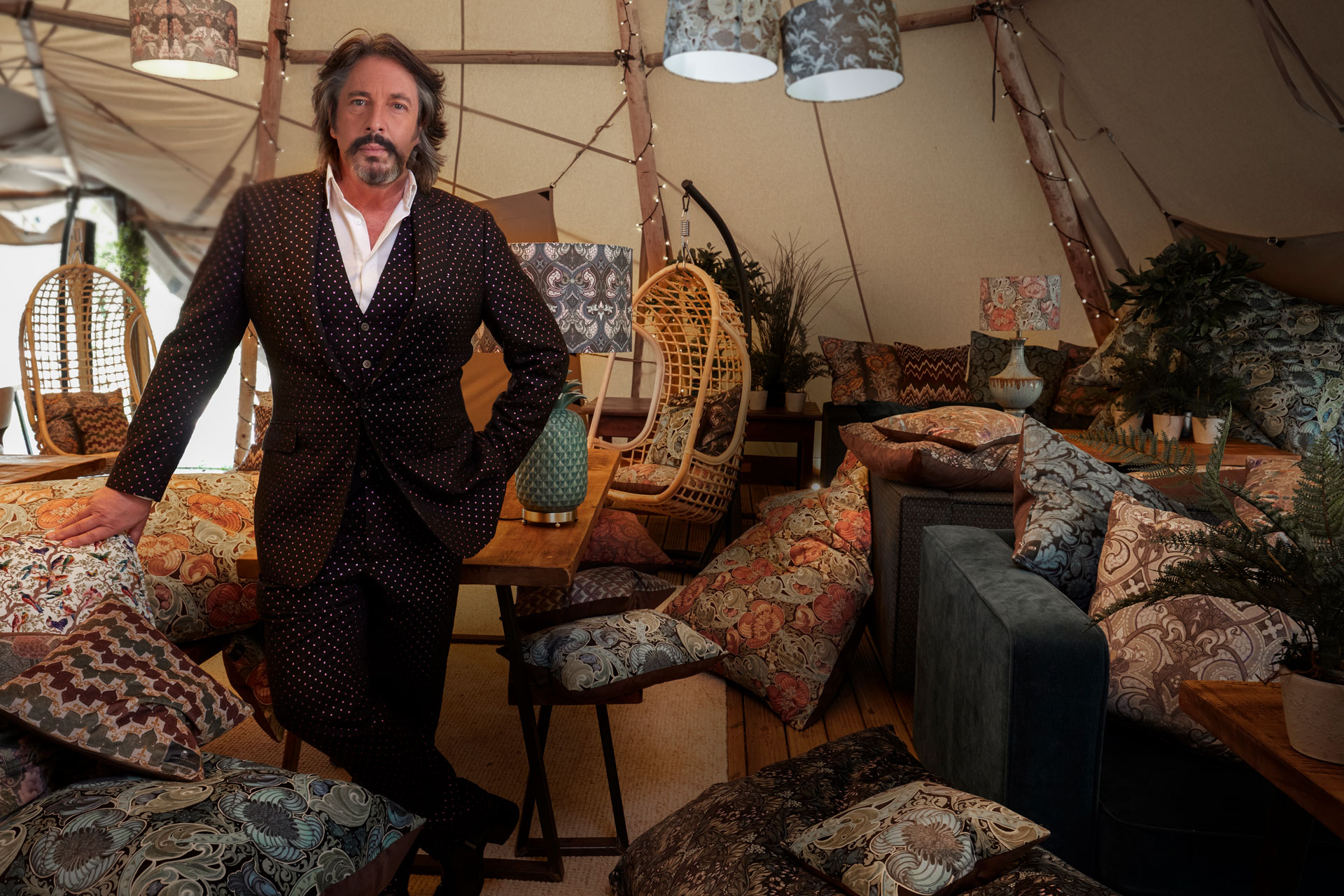
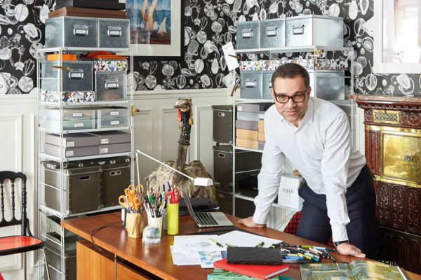
If you ask interiors TV star Laurence Llewelyn-Bowen what he thinks the Cotswolds needs, it would not surprise you to hear his answer: more colour and – certainly – more pattern. The Dial House, the Bourton-on-the-Water hotel recently acquired by Maxi and Pimol Srivikorn, was his opportunity to remedy this.
‘I’m bored with the Cotswold cliché – you know, the same shades of grey estate furniture and, basically, discomfort,’ Laurence explains. ‘Whoever said that modern design needed to be uncomfortable must have been some sort of evangelical Presbyterian.’
The characterful hotel dates back to 1698. Styled in the ‘Cotswold Vernacular’, its deep set stone walls host many cosy nooks and crannies, as well as inviting fireplaces. But before its purchase in 2020, it fell prey to being pedestrian in its design – something Laurence definitely isn’t.
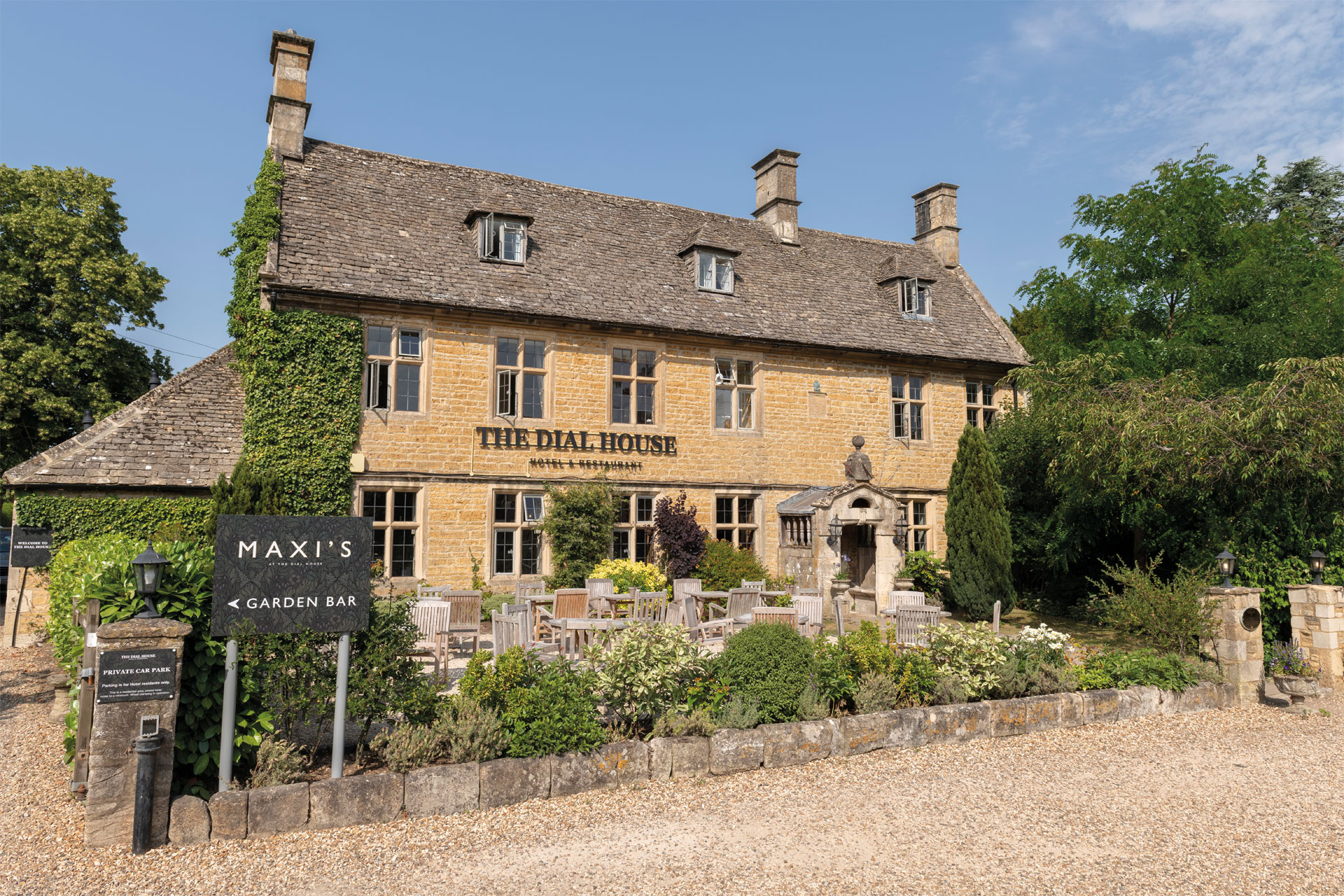
The beautiful hotel dates back to the seventeenth century
The designer is renowned for his love of maximalism (his book, More More More was published by DK towards the end of 2022), and owners Maxi and Pimol were happy to indulge his love of the kaleidoscopic. In particular, Maxi encouraged it – the owner trained in gemology and creates high-fashion jewellery for clients across the globe. The pair were a design match made in heaven.
Their plan was to completely revamp the rooms – reupholstering furniture (with items like sofas and armchairs provided by the Srivikorns) and replastering walls for new wallpapers. This called for original designs from Laurence. ‘I started off with old-fashioned ink drawings for the new patterns and motifs, and then we brought it to life on the computer,’ says Laurence.
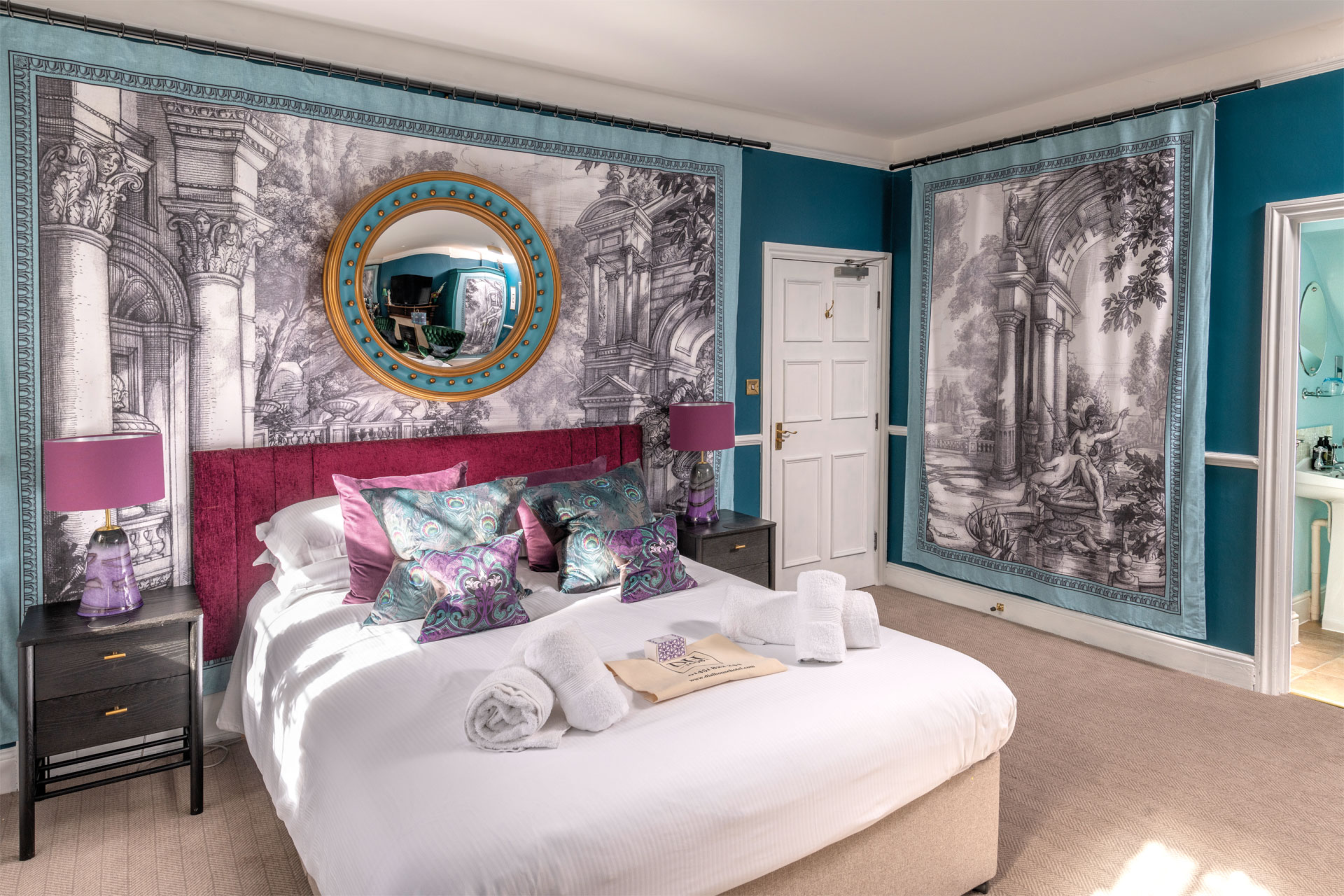
Hand drawn designs form the basis for the tapestries seen in the Aubrey suite
The next step was figuring out how to work with the spaces – some tiny, like the May Morris room – without overwhelming them. ‘You can’t make a small space bigger through design, but you can make it more interesting,’ Laurence purports. ‘The May Morris room became a jewelbox in the detail… It went from the room they’d struggled to invite people into, to the most popular room.’ The designer leant into its intimate dimensions, rather than employing visual tricks to ‘conjure’ space. Warm textured wallpaper adorns the walls making the room enticing, and with a soft, velvet orange armchair, there’s a sense of cosiness. The doors to the guest wardrobe and bathroom are hidden in floral wallpaper, deliberately compartmentalising the space.
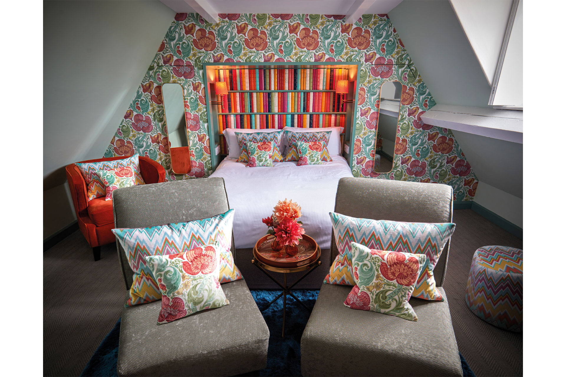
The May Morris suite is now one of the most popular rooms to stay in
Laurence does not think that ‘maximalism’ is a passing trend. In fact, he believes this redesign pays homage to the history of The Dial House. ‘Maximalism isn’t a modern trend that’s sprung up overnight. When The Dial House was built centuries ago, the builders would have been appalled with the space being left in such dull colours,’ he says, ‘and they would have loved the kind of pattern and detail and richness I put in.’
And, even if the builders of old aren’t here to approve, the guests certainly do. A true feast for the eyes.

