Case Study: Sacha Walckhoff’s Parisian Apartment
The maestro of clashing prints
Sacha Walckhoff throws the design rulebook out of the window, finds Sofia Tindall
Fine Print: Sacha Walckhoff’s Parisian Apartment
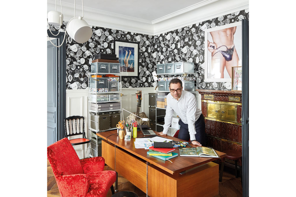
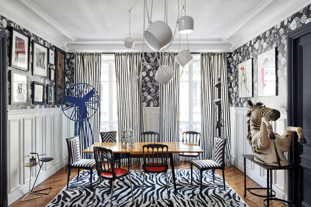
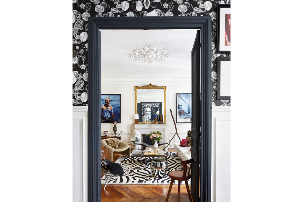
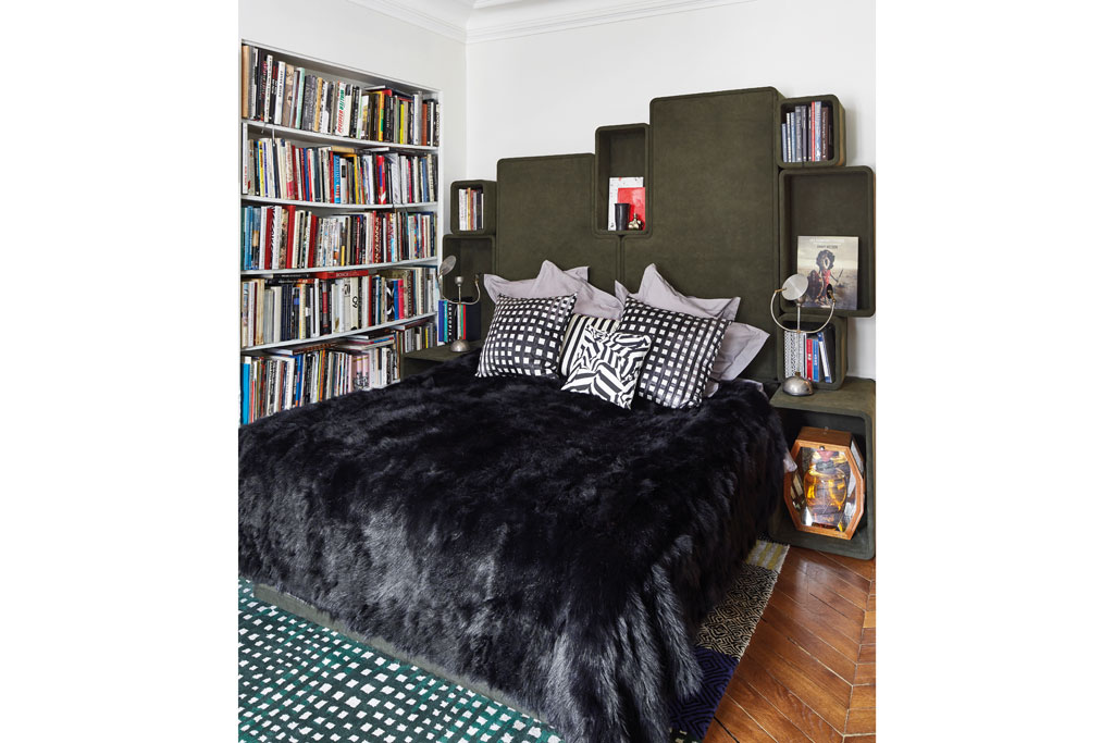
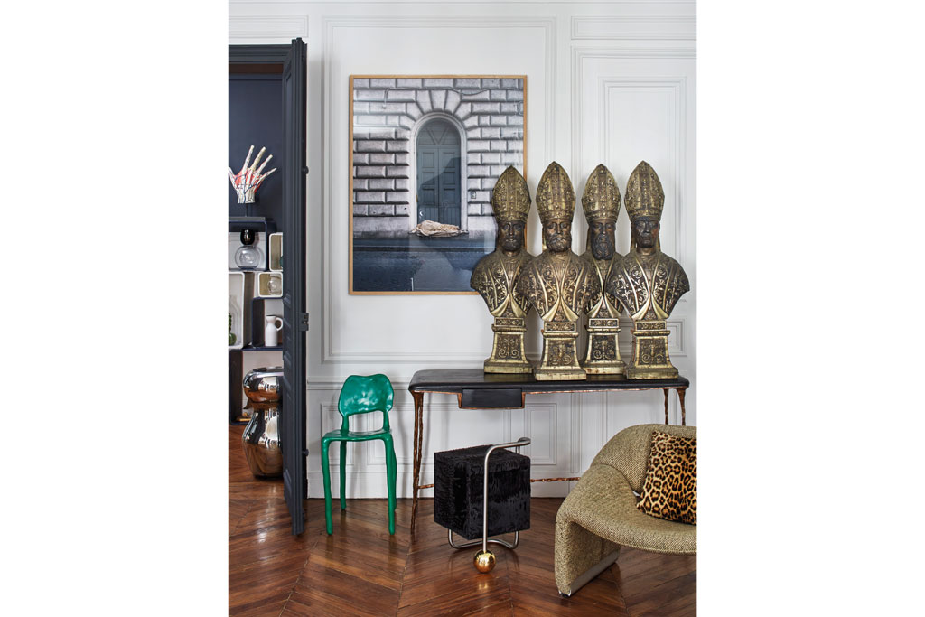
It takes a special kind of skill to clash multiple animal prints. But there’s one person who is fearless in the face of breaking pattern rules, and that’s Sacha Walckhoff. ‘As Diana Vreeland said: “The eye has to travel,” explains Walckhoff. ‘You need eye-catching pieces; some colours but also neutrals to create a lovely contrast.’ Fittingly, his Parisian home, an apartment of ‘typical Louis Philippe architecture’ that had been virtually untouched since the 19th century, is a riot of graphic stripes, coloured zebra and leopard print. Nothing is off-limits here – and yet somehow it works.
Perhaps Walckhoff’s eye for a bold print is the result of having traversed the glossy floors of so many fashion houses. Kenzo, Michel Klein and Christian Lacroix Maison, where he’s been Creative Director since 2009, have all had the Walckhoff treatment somewhere along the way. Most recently he’s turned his talents to solo ventures – a furniture collection for Parisian gallery Gosserez that is overflowing with covetable pieces, and the recent Magic Garden china collection for Rosenthal.
When it comes to his own house, which he shares with his partner Pascal – a hair designer for the Comédie-Française – there is ‘always something black and white, something graphic. Stripes are a must.’ On the walls, the art must be ‘popping out’ with ‘a lot of dark grey, velvet and damask drapes but hung in a simple way.’ This is the Sacha Walckhoff school of design: divine madness, but underscored with just enough restraint and simplicity to tie the whole thing effortlessly together. It’s a design tightrope, but Walckhoff is a maestro of it.
Everyone else seems to think so too; his last home was selected for the prestigious honour of being one of 400 greatest rooms of the century by Phaidon. It’s quite something to think the designer relaxes in the evening in one of the living rooms to have defined the last 100 years, which he’s also recreated in his new apartment. His design heroes are the French decorators Henri Samuel and Madeleine Castaing, but unsurprisingly, given the theatre of his home, he also takes a cue from masters of French film and photography: ‘I love what Jean Cocteau or Cecil Beaton were doing with their houses’.
While the eye is automatically zoomed out in Walckhoff’s home, like a Warhol painting there are treasures to be found if you look closer. A screen that covers the vestibule is made with 17th-century gilded Cordoue leather panels that Walckhoff discovered in a Parisian flea market, and the earthenware stove and marble fireplaces are original pieces.
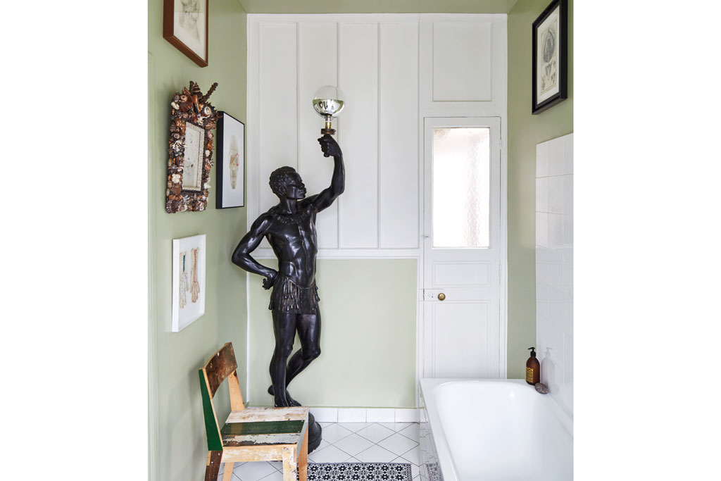
Farrow and Ball paint throughout mellows the overall effect, with Anthracite on the double doors and a pale green shade in the bathroom. ‘It makes me happy every morning!’ says Walckhoff. His parting advice? ‘Each room must be like a small landscape and has to lead you to the next one. Above all the place must look like you; to be the happy reflection of your personality.’
MORE CASE STUDIES:

