Milan Furniture Fair 2024: The Highlights
By
11 months ago
A look back at the 2024 Salone Internazionale del Mobile
Wondering what went on at the Milan Furniture Fair 2024? The International-Salone & Fuori-Salone was on fire with divine design, says Wendyrosie Scott.
A Look Back At The Milan Furniture Fair 2024
The 62nd Edition of the Milan Furniture Fair recently concluded, and what an overwhelming wonder it was. Better known as the Salone Internazionale del Mobile, the behemoth international design event is the global benchmark event for the furnishing and design sector. It’s a future-forward furnace of a fair in which ideas, collaborations, installations, discussions, products, projects, inventions and creative designs are hot, hot, hot.
What Is The Milan Furniture Fair?
Stretching across the city in various vicinities (though particularly the Brera Design District) what starts as a sizzling series of design launches and parties across its one-week duration sees several attendees on burnout by the end, endeavouring to experience it all. With creations from many continents, all showcasing progressive approaches to the (ever-widening) world that defines design, the show is ablaze with inspired and inspiring ideas whose glow remains year-round, igniting right on time for the following year. With plans and collaborations already being discussed for 2025, it remains the most anticipated annual design event. And with good reason.
The event’s ability to attract the great and glorious from across the globe is revered and renowned. With close to 2000 exhibitors at this grand affair of products, pragmatism, art and aestheticism, established creatives are easily enticed. From iconic brands and the established fashion-faithful to emerging designers fresh from college, it is a congregation of the highest calibre, with cutting-edge thinkers, disruptors and makers. This year, one of the most anticipated participants was undoubtedly David Lynch: multi-talented, many-layered and with a mind to conjure both contemplative dream spaces and unnerving ones. Originally known as a director/film producer, Lynch is keen to sway away from this moniker and move on.
The Milan Furniture Fair is a world within a world, where inclusivity and international collaboration are the fair modus operandi. Though far less size-wise than the behemoth it has become, it’s lost none of its substance: this year saw a record attendance of 361,417 visitors (54.3% from overseas) and 1950 exhibitors from 35 different countries. The event’s theme, ‘Materia Natura’, may not necessarily appear aligned to what is essentially product hype and sales; however, bigger than the sum of its parts, the show acts as an informed provider and enabler, championing makers and manufacturers in the art and design realm who can positively impact change. It’s a revelatory, inspirational and dare I say- life-affirming celebration, filled with promise for a finer future, and people determinedly working collaboratively and globally, to seek solutions.

This Year’s Highlights
The Croatian Installation: A Matter of Style, Substance and Sustainability
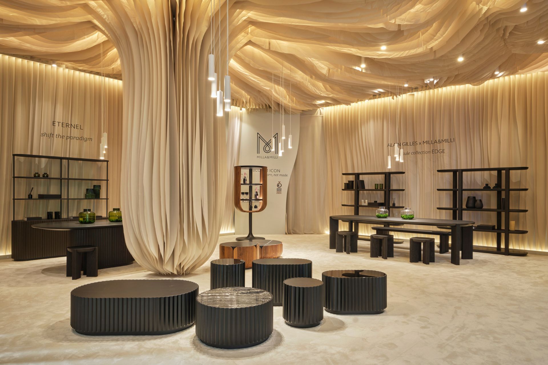
Milla & Millis’ compelling installation garnered instant attention, even against gargantuan competition. It’s a calming, enveloping creation with a powerful presence, seamlessly encompassing the furniture companies’ ecological principles.
A memorable Milan highlight, the brand’s award-winning conception was the creation of Masa Vukmanovic, who also designs some of the furniture and contributes elements of the company’s ethos. Hailing from Croatia, company founder Ivan Krisanec enthusiastically detailed how everything is locally and sustainably sourced, right down to fixtures and fittings, and any local wood utilised is immediately replaced. The organic-style architectural design, created from canvas off-cuts and hung high from the ceiling with boards securing the structure, appears as a giant mushroom providing a welcoming and serene shelter. Masa explained that brand values focus on duality, the attraction of opposites and complementary elements – a notion mirrored in materials such as wood, steel and natural textures. Showcasing a deep love for nature and a gratitude for the materials used, the company aims to ‘create beauty from beauty’. Combining contemporary modernism with a more ancient philosophy and folklore results in pertinent and appealing products such as the Waves and Bloom collections.
Multi-talented Masa takes pride in her work, and after imparting my love of the installation, she replied: ‘An enchanted forest is what I like to call it, reminiscent of an oyster mushroom, but also a giant flower. Everyone is free to see whatever they want in it.’ Indeed. A welcoming shelter from the show’s chatter and gleam, with a unique luminescence. millamilli.com
The Cabinet Of Curiosities
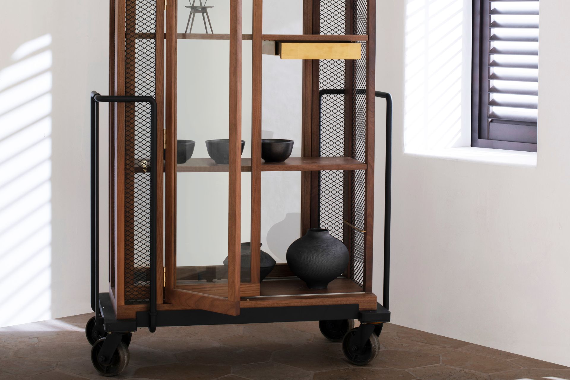
With much in Milan designed to delight, the Cabinet of Curiosities – with its skillful composite parts of clean-cut contemporary style, elegant aesthetic, quiet luxury and otherworldly whimsy – shows an appeal both instant and enduring. The cabinet was a multi-changeable compartmentalised ‘wardrobe on wheels’ (black steel powder-coated castors, to be precise); or, depending on preference, a display cabinet of divine design, fit to house fineries. Made from solid natural walnut, wood veneer and tempered glass, it deftly balanced pragmatism with play. A timeless design classic and surely a future heritage heirloom.
Stellarworks, a Japanese furniture brand based in Shanghai, also presented their installation entitled the ‘Canvas and the Plinth’: a sophisticated artistic showcase of interior products in a series of stand-alone spaces designed by creative directors Neri & Hu. Well worth the journey slightly outside the central city to Viale Garizia 14/16, Milan. (However, had it not been for the select recommendations of Danielle Demetriou, an informed insider and consultant on all things Japanese design, this now favoured design would not have been discovered.) stellarworks.com
STECCO, FIMA & Carlo Frattini Designs
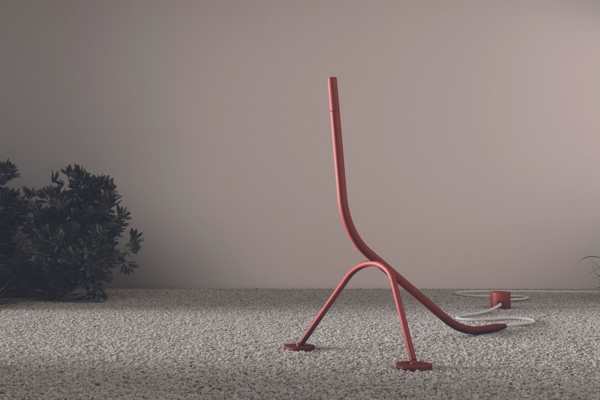
This product form cannot fail to bring a smile, with its animated, animal-like appearance. Not dissimilar to some robotics, its anthropomorphic form engenders an empathetic response as though it’s a living creature – a ‘pet’ that needs minimal care. Clever. An eye-catching product whose streamlined simplicity, earthen hue and subdued finish make for a winning format where function and form are in unison. Humorous and ingenious, this free-standing shower is utterly unique and a limited edition item from FIMA.
Its fragile aesthetic belies its sturdiness and adaptability for indoor and outdoor usage. A future-forward approach (which encompasses sustainability while peaking the quirky design scale), it’s made from fully recyclable stainless steel and also acts as a water regulator. Operating as a handheld product and stand-alone art piece, it would be at home in the house, or hidden in plain sight in the garden: an item perfectly aligned with the Salone International theme and surely positing how environment, ecology and design philosophy can act as a triumvirate. fimacf.com
Essenze di Luce’s Outdoor Speaker
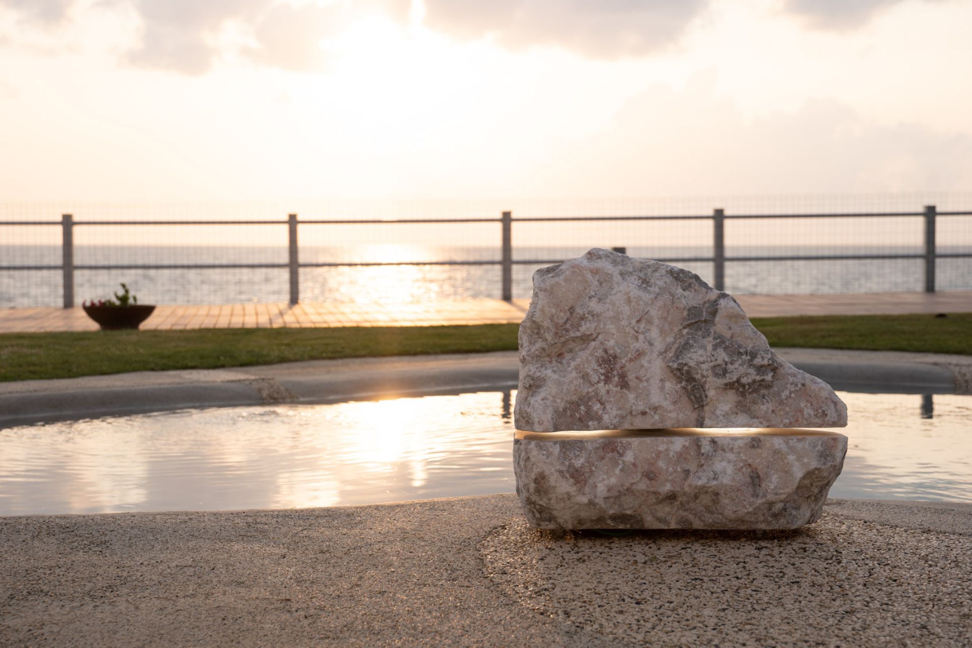
Essenze di Luce has created a jewel of usable sculpture: a sustainable light and sound system featuring natural stone such as onyx and marble (created from waste materials) and using a post-extraction process involving pieces too small to be sold in the marble industry. Hand-crafted by Italian makers, so cleverly conceived and (forgive me) so beautifully in tune with nature, its use defies belief. Operated via an app or integrated with pre-existing audio systems, its hardy design is suitable for indoors and out. A rarity which genuinely deserves the divine design moniker, and its very presence brings peace – unless you want to party: the Menhir Sound Pro features a single luminous cut-out with two LED light sources inside, located at opposite poles, for a scenographic light effect. The brand processes waste (i.e water) in a sustainable system of recovery and reuse, including replacement parts. The result is a reliable and durable product with a timeless design that goes beyond fashion and material trends. Yet nature is in fashion! Yes, we have ‘seen the light’ (apologies again) and are placing the natural world centre stage. essenzediluce.com
London Art Wallpaper
A link to London unexpectedly came in the unusual and tiered design stand of the noted brand London Art Wallpaper, which gave anyone with vertigo a dizzying challenge while making the most of its odd but wondrous Tardis-like space. With interior products that complimented its art ‘murals’ including an Eames design classic recliner, the brand brought exoticism and decadence; scene-stealing and breathtaking escapist wall art and scenographies ranged from enchanted to suggestive. The utter wonder of the Fuorisalone strikes again, enabling anything and everything to temporarily turn host and in doing so, platform provocative ideas and approaches to perceptions of art and architecture. londonartwallpaper.co.uk
Fashion Installation Crossover
Combining interiors, fashion, luxe pet carriers, bags and hats – but not as we know them – German leather company MCM hosted a humorous installation which revelled in its effective simplicity and surreal nature. Straw hats hung as though mushrooms, enabling them to transcend their traditional role. Conceived by Atelier Biagetti, the MCM Wearable Casa Collection was curated by Maria Cristina Didero. Taking part in Fuorisalone for the first time, MCM put on a great show in the grandiose Palazzo Cusani: an iconic building which sits proudly in the heart of Milan’s beautiful Brera Design District. mcmworldwide.com
Ellie Saab Interiors
Launching at this year’s 2024 Milan Design Week was globally established luxe fashion designer Ellie Saab’s ‘Lobster’ chair. The piece was designed by Carlo Colombo, whose creation’s cradling curves place it in the divine organic design style category – a movement with roots in both 19th Century Art Nouveau and 20th and 21st Century Modernism which can be seen in many architectural masterpieces, especially in the USA. As far as furniture goes, this remarkable creation hits the high scale and is certainly a statement structure, with overtones of an Eames design classic. Having conjured an aestheticism so wholly aligned to its inspired design source, its likeness to a lobster, albeit in gigantic form, is both beautiful and yet tinged with a slight sadness (knowing the vulnerable life of lobsters). The innovative steel frame perfectly captures the style and shape of the crustacean carapace, whose rich red leather echoes the shell. Wholly in line with the 2024 Salone theme, ‘Materia Natura’, these earthen and desert hue tones are naturally fitting in with Saab’s ‘Nights of Wonder’ concept and the art of embodying nocturnal creatures. The result is a captivating and emotionally moving creation which will remain in mind for many reasons. It would be wonderful if Ellie Saab Interiors could have perhaps highlighted the plight of these creatures and raised awareness of endangered lobsters, as well as how unsustainable fishing practices and overfishing (especially in Europe) detrimentally affects lobsters. But there is time yet for this support. eliesaabmaison.com

The Carpet & Tapestry Edition By Ken Scott
Being, ahem, floored by floral tapestry art rugs presented a special Salone moment among many. A noted designer across multiple realms, particularly fashion, Ken Scott took a multifaceted approach to design which lives on. The brand’s stand was a place of peace, yet fun. In deep pile, brightly coloured and highly detailed and tufted mini woollen masterpieces hung high on makeshift walls, affecting an immersion into a surround sound of silence and awe. Explosive bold blossoms from indulgently plush ‘plant’ tapestries bewitched me! Personally, being enamoured by the beauty of design is often tinged with shame for an object of superficial desire in an age of climate crisis and overconsumption; yet this was an aesthetic, appealing and beatific item of style and craft. In this case, a limited design in natural materials: namely, New Zealand wool. Well sourced, tactile, comforting, and yet so sensuous, it would knock the clergy off guard. Far too swanky and chic to simply grace a floor space, these are works of art which would adorn horizontal or vertical planes in equally pleasing measure. kenscott.it
The House Of Switzerland
In a collective exhibition bringing together emerging designers, universities, studios, brands and galleries from across the country, the Swiss Arts Council, Pro Helvetia and Presence Switzerland showcased Swiss-related talents in contemporary design. Seeking to ensure collaboration increases the visibility of visionary emerging creatives. As an anthropologist, cross-cultural creativity holds a particular interest for me, and the House of Switzerland’s collaboration with Korea presented products which were innovative and quirky. Also, the notable para raincoat for wheelchair users by Tabea Wschiansky gave a well overdue voice and cover to this area of design (although unhiddenclothing.com in the UK has been platforming this for years: attending fashion conferences, I have witnessed it garnering momentum with Italian and Portuguese students, often at the forefront of this research). The series of re-designed/upcycled chairs, which evoked provocation and contemplation, presented a curious take on an antique and modern mix. Through topics such as circularity, wellness and connection to nature, each project offered a unique exploration and interpretation, working toward positive change. Enabling visitors to interact with some designs, I saw several adults eagerly awaiting for children to finish so they could use them! Interaction for all is key, as is play, since surely we are all young at heart. houseofswitzerland.org
Tubes: Sculptural Italian Modernism With A Twist
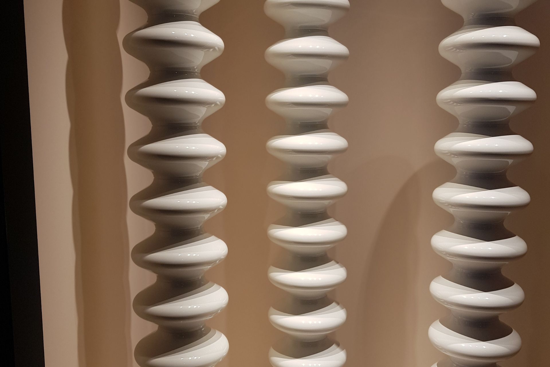
Warm yourself with the most stylish of designs whose wow factor is assured. Standing tall with certainty and grace, these futurist sculptures are in fact, radiators. The highly contemporary designs transform what is essentially a heating element in a room into the heart of the space with serious style, creating a talking point with a strong identity. Founded in 1992 by the Crosetta Family, whose unconventional products and innovations are founded upon a formal language of design in perpetual evolution, Tube’s vocation has always been to give shape to heat through design. Their experimental and native technical inventions have transformed the concept of traditional radiators from simple technical systems usually on the fringes of a space to as protagonists of interior aesthetics. Tube’s mission statement is rooted in the principles of ‘design does not follow function’: it is itself function.
With their largest space to date at the Salone Internazionale del Bagno (the gigantic area devoted to all things bathroom), curated by Studio Palomba Serafini (with whom they’ve collaborated since 2004), the company’s radical approach has been recognised by prestigious international institutions of contemporary art and design including the Center Pompidou in Paris, the International Design Museum in Munich and at the MAC (Musée d’Art Contemporain) in Montreal. tubesradiatori.com
The Roberta Basta Design & Antiques Store
The Roberta Basta space in the Brera Design District is an ostentatious pillar of the creative and craft community, just like its theatrical owner. A member of several respected and revered art and antique associations, the significant-sized store is immersed in design. With extensive credentials and great heritage, alongside an eye for the rare and desirable, their classical and contemporary pieces make a great talking point. Just like their parties…
Suited and booted bow-tied bouncers alongside young and trendy gate-keepers with a strict door policy all stood in front of an open glass frontage that seemed to serve as an even greater temptation for those on the outside trying to get in. The red carpet and roped balustrades could barely hold back the heaving queues, given the premises were already at a generous capacity. And what a wild world of wonder it was. Attendees matched the elegant and artful surroundings, all of which delighted in their decadence. Dressed for attention and aestheticism, gilt, gold and glamour appeared to be the order of the day. A substantial group of performers needed no plinth as they stood on the second level of the four-tiered store, surrounded by unique antiques and contemporary art, and sang to surely the most alluring and appreciative audience and surrounds. Italy’s glitterati, art and fashion practitioners and poseurs indulged and participated in a joyous celebration of style: Singing and dancing with the performers with not a jot of self-consciousness. (Welcome to Milan!) This was the sparkling extravaganza that could dust away a bad day and whose attendees, artworks and appeal reached across generations.
A Thinking Room By David Lynch
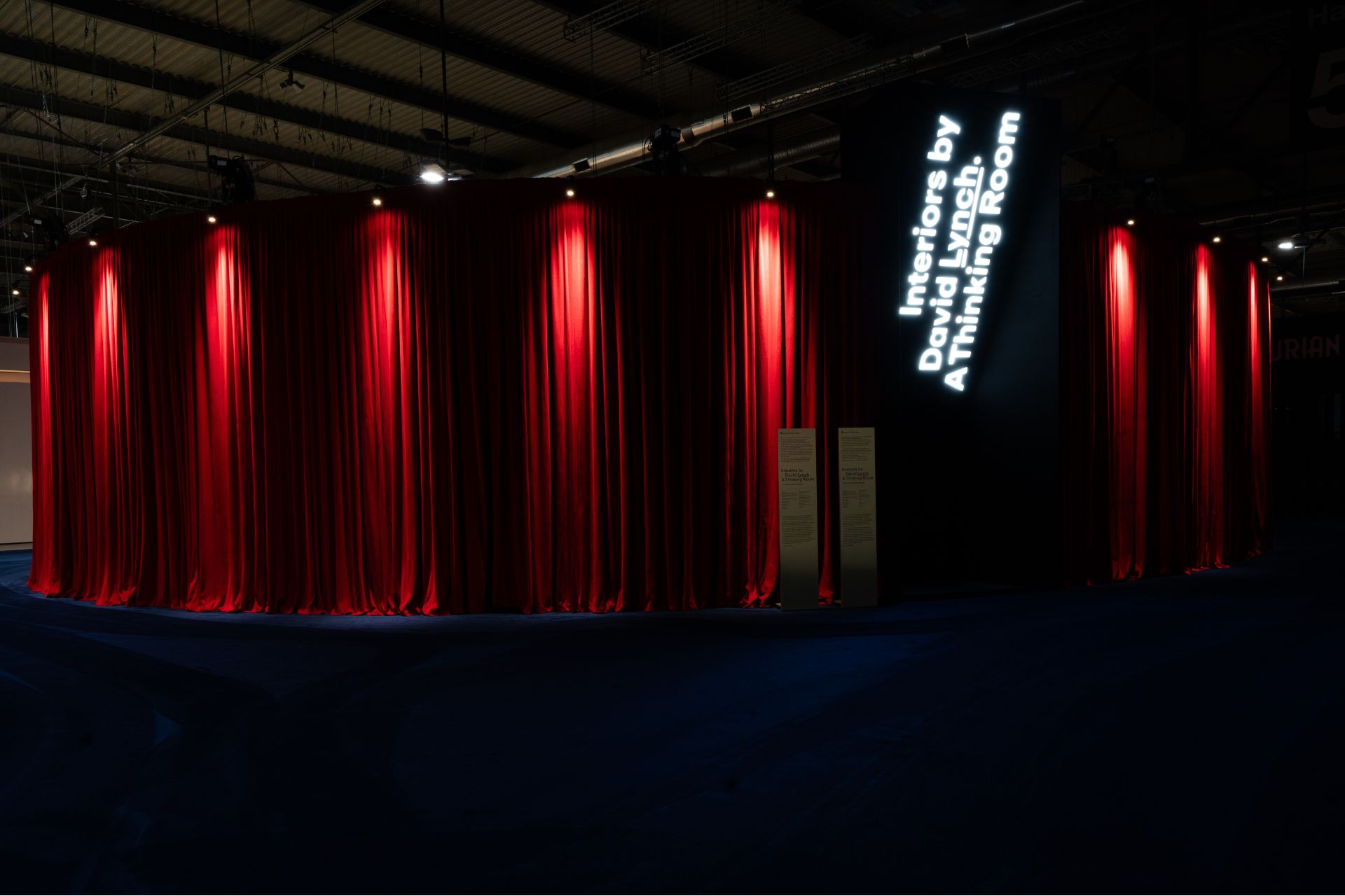
David Lynch
The noted name to draw attendees undoubtedly goes to film-maker David Lynch: multi-talented, many-layered and with a mind that creates work which exists in a world that is part terrifying, part fascinating, always naïve, with a third eye on the future, and frequently dystopian. His surreal 1990 series Twin Peaks has lost none of its impact and set a trend in TV series for the theatrical, dreamlike and bizarre. So, would the hype be worth it? Not exactly. And while eager to side-step his director role for the designer-maker role, his signature theatrical stage sets, resplendent with his noted use of velvet curtains, acknowledge the importance of interiors across much of Lynch’s work.
The modest-sized set by Lynch at Salone del Mobile, entitled ‘A Thinking Room’, was created as a meditative, immersive and participatory space which amplified the stillness of his work. With projection film and tools for usage, the ‘stage’ set was surprisingly quiet despite its surrounds. Lynch clearly set an intention. Curated by filmmaker and writer Antonio Monda and created in collaboration with Piccolo Teatro di Milano, the room invited visitors to sit at a small but centrally positioned desk-distinctly for use, complete with paper and pens. People immediately set to work. Surprisingly democratic, it was a stark response to the gargantuan queues outside which snaked seemingly without end to enter. Lynch, as ever, lured them in.

