This Nine Elms Penthouse Is A Masterclass In Soft Minimalism
By
6 months ago
The team at 1508 London takes us inside this gorgeous home
A Hong Kong-based family wanted their Nine Elms penthouse to be an elegant and yet functional holiday residence. We asked the designers at 1508 London to tell us how they employed the principles of soft minimalism to transform the space.
What Is Soft Minimalism? Inside A Luxurious Nine Elms Penthouse
Tell us the story of this project…
1508 London’s studio was appointed to design a spectacular penthouse apartment in the Nine Elms area for an international client with young children. Intended as their London residence during holidays, the client desired a ‘lock up and go’ home with timeless interiors that would evolve with their growing family. The penthouse, accommodating multiple generations, will be occupied for a few weeks each year.
The design dedicates the first floor to the living area, creating a welcoming space for family gatherings and children. The second floor features a separate apartment for grandparents, along with a luxurious swimming pool and terrace. Direct lift access to the penthouse ensures privacy and convenience, with a private lift opening into a lift lobby.
What was the client brief?
Creating a timeless and elegant look that also focuses on comfort and practicality which the family can enjoy for years to come. 1508 wanted to design a soothing haven with a feeling of a luxurious five-star hotel for visiting family and friends. The children’s rooms needed to be playful but easily adaptable as the children grow, and the entire layout was improved – including the master bedroom and the powder room, which was redesigned with Feng Shui principles in mind.
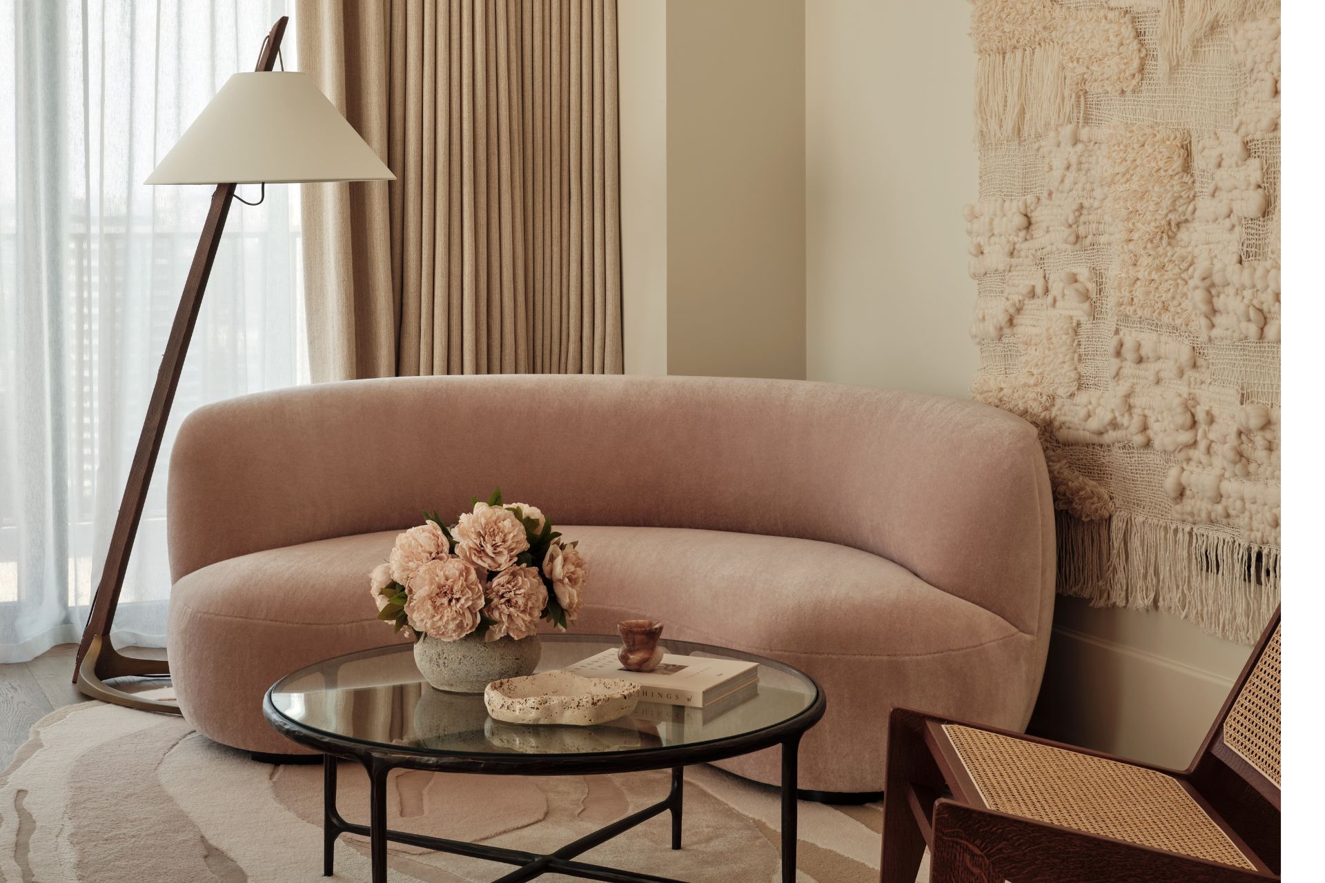
How would you define soft minimalism?
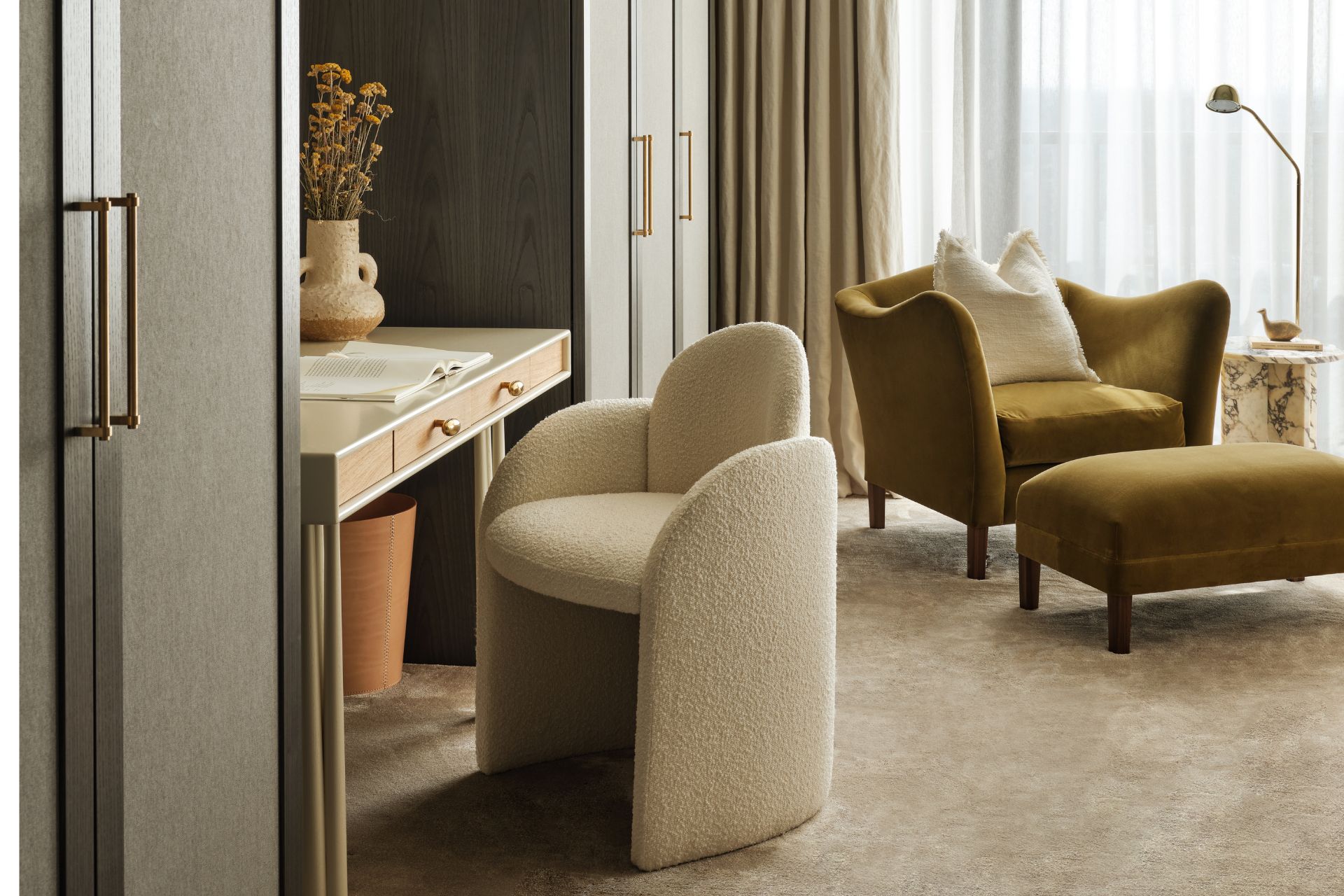
We definitely applied a soft minimalism approach throughout the interiors. For us, this means utilising a restrained palette of textural materials to ensure consistency across all floors. Soft minimalism is defined by curved lines and gentle tonal hues. It’s all about creating serene, uncluttered areas that feel warm and inviting. The aesthetic combines the simplicity of minimalist design with softer textures, natural materials and a muted colour palette to achieve a harmonious balance between functionality and comfort.
We wanted to create an understated aesthetic, but one with a tangible luxury note. The space needed to unfold softly to reveal an ethereal space that’s felt and experienced more than it’s seen. Soft minimalism means underplaying this sense of luxury, which is always a challenge creatively: spaces and furniture should be crafted with a high degree of skill, and every joint, connection and detail is intentional and finely tuned, each playing a specific role to serve a larger whole that’s engaging on an emotional and practical level.
Soft minimalism is not just a style; it’s a lifestyle choice. In luxury settings, it means curated spaces where every piece serves a purpose and tells a story. Our goal was to create an environment that’s not only beautiful but also evoke a sense of tranquillity and wellbeing. It’s about finding beauty in simplicity and allowing the space to breathe.
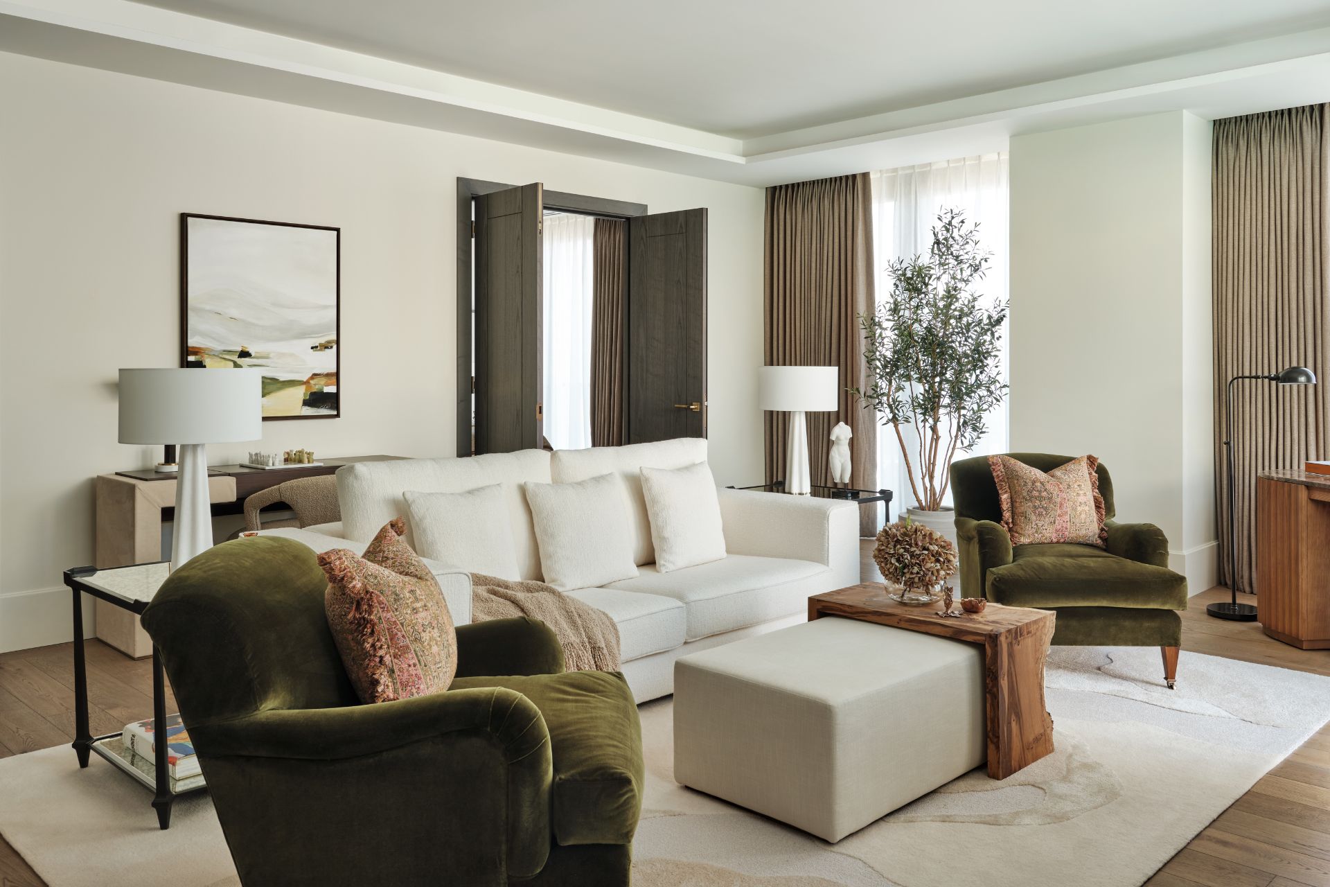
What kind of materials did you work with?
When it comes to soft minimalism, the choice of materials is crucial. We generally lean towards natural, sustainable materials like stone, wood and linen, which add texture and depth without overwhelming the senses. In this design scheme, muted colours included warm whites and pale pinks, providing a soft and coherent backdrop. Textured materials included oak, travertine and richly veined marble.
Talk to us about your early inspirations for the project. Did you pull together a moodboard?
We started by presenting concept images as an initial talking point to gauge what the client liked and disliked. Once we established a look and feel, we presented the client with a design direction and furniture selections for each space. Physical sample boards were prepared and sent to the client in Hong Kong for signoff.
We drew inspiration from the location, wanting to use natural materials: interesting woods and stones, layering of textural fabrics and curved forms to soften the spaces. The family also stressed that none of the furniture should have sharp corners for the safety of the children, and this inspired us to source organically shaped and rounded pieces.
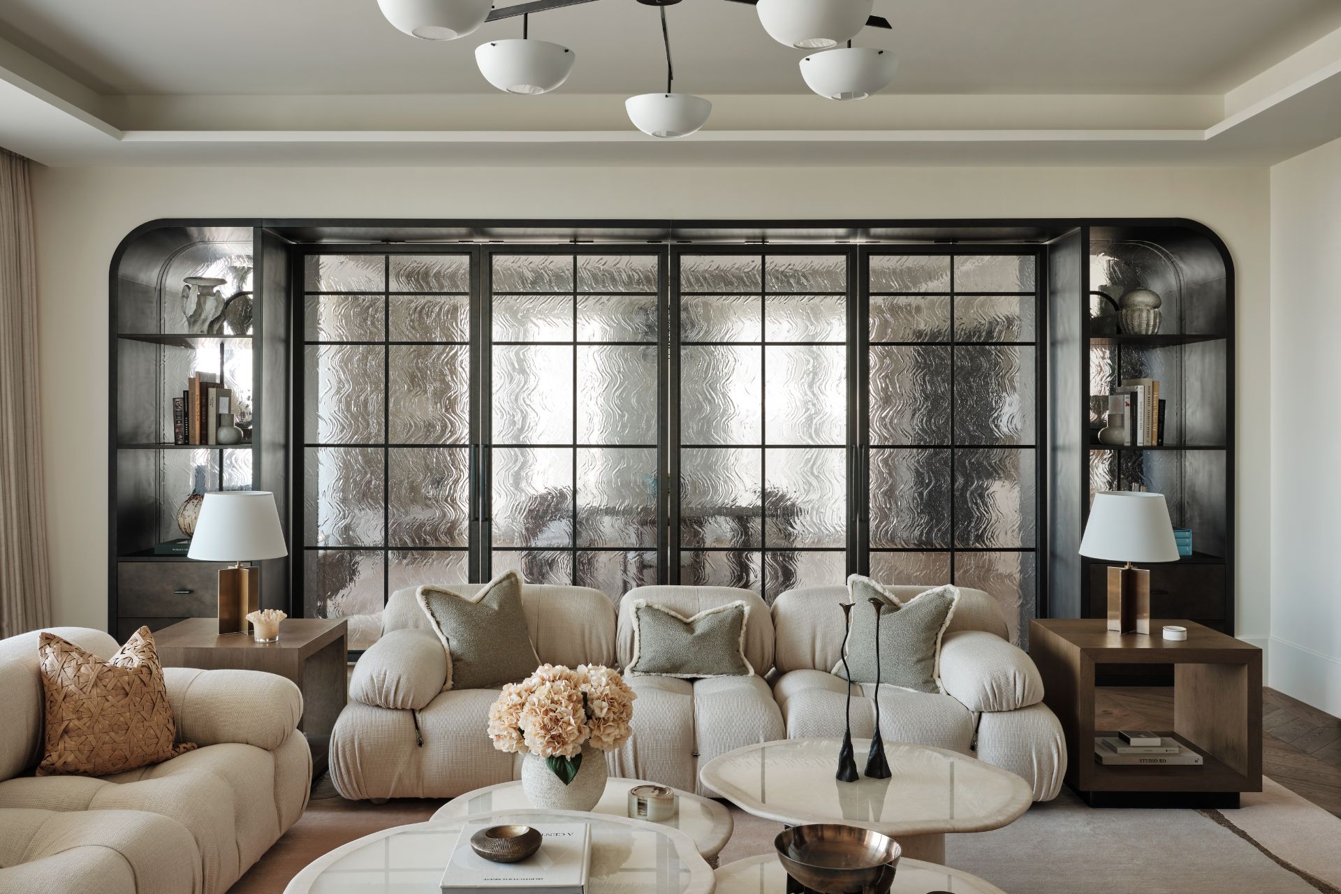
Tell us more about the living room.
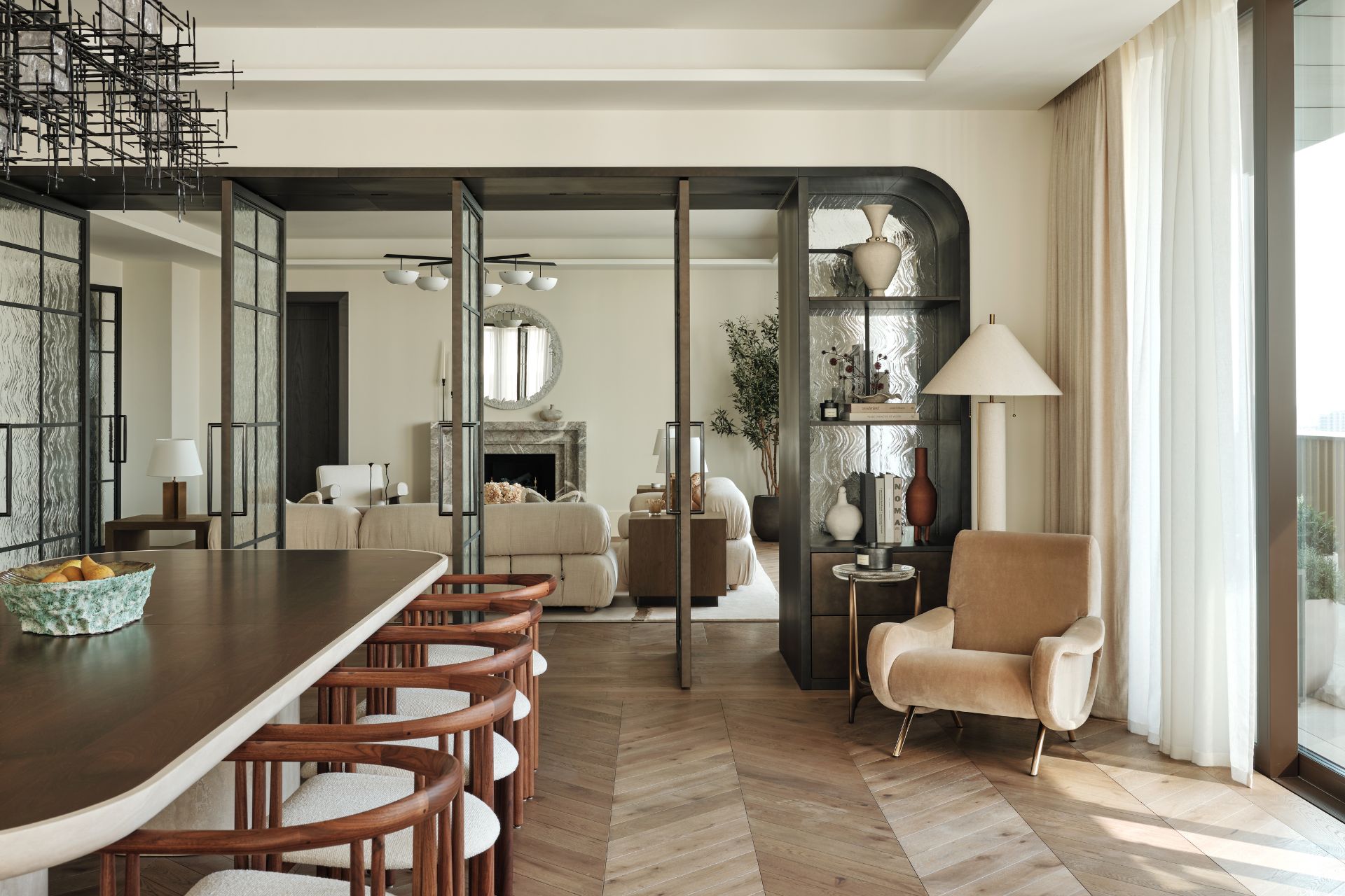
The living room showcases bespoke joinery in the form of partition doors by The Interiors House, featuring a bronze-effect timber frame, a liquid metal look to the drawer-fronts, and textured glass panels. You’ll also spot a Cameleonda Sofa by B&B Italia. This iconic mid-century piece creates a subtle contrast with the Joan Duo coffee tables by Marbera Studio, which are made from onyx and travertine.
Another gorgeous piece is the Croisillon Lamp, designed by Jean-Michel Frank; it really compliments the linearity of the Ferro Chandelier in the dining room. The Nami Tall Cabinet by Demuro Das – made from glossed wood and bronze – is a real statement, featuring richly textured bronze door-fronts that emulate swelling surf.
What was the vision for the principal bedroom?
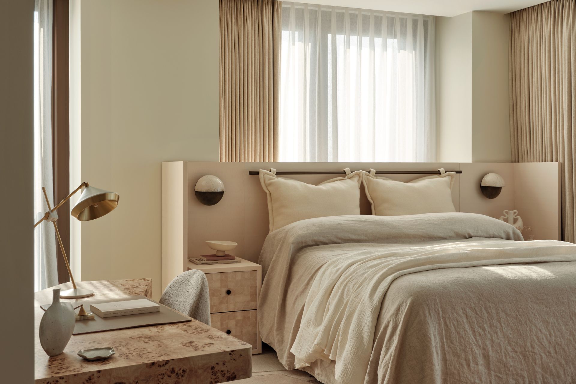
The principal bedroom contains a bespoke headboard, a custom-made TV unit and two side tables, all of which are made of figured sycamore that comes in a beautiful off-white tone with a gentle rippled texture. The sofa was designed by Pierre Augustin Rose and is upholstered in mohair velvet by Pierre Frey. We particularly loved the bespoke travertine console table by Atelier278, an independent London-based brand specialising in stone furniture.
Were there any challenges on the project? How did you work around these?
One of the main requests we received from the client was to create a sense of home and warmth despite the property not being occupied all year round. We commissioned beautiful dried flower arrangements by Emily Ayres of Design By Nature Flowers for key spaces, knowing they would last for years to come, as well as faux outdoor plants for the terraces. We also scoured antique markets and vintage stores in search of objects with a story to decorate with.
Since the client was based in Hong Kong, all our meetings and presentations had to be done over a video call – the only time we met them in person was during the walkthrough and handover!
Were there any sustainability considerations in the project?
Our goal on every project has always been to source and manufacture locally, using UK and Europe-based suppliers, artisans and craftsmen. We tried using natural fabrics for most of the bespoke and custom furniture, which were sourced from suppliers like De Le Cuona, Rose Uniacke, Romo, Pierre Frey and the Designers Guild.
How could readers recreate this look at home?
Despite the project featuring many bespoke and high-end pieces, high street retailers such as Soho Home, West Elm, Anthropologie and Zara Home were also used throughout. For unique finds, head to antique fairs and look for unusual objects to dress tabletops and shelves.

