Interiors Inspiration: An Art-Filled Townhouse In Notting Hill
By
2 months ago
We’re lusting over this London home
Artwork and interiors might go hand in hand, but it isn’t always easy to figure out how exactly to incorporate art into your interior design. Luckily, London-based firm Taylor Howes did just that in a recent project – and we sat down with them to learn all about it.
Taylor Howes On How To Incorporate Art Into Interior Design
What’s the background and story of the project?
This project is a beautiful townhouse, a stone’s throw from the buzz of Notting Hill. We were initially brought on board to help with some accessories, but we totally hit it off with the client, who has a keen eye for art and design – and they eventually asked us to design not only key areas but also to help redesign spaces that just weren’t working for them. Their artistic flair paired perfectly with our vision, and we loved bringing their bold choices to life.
What was the brief?
The clients asked us to create an elegant family home that reflects their energetic and social lifestyle. We were keen to incorporate their diverse art collection into the interior design, creating luxurious living spaces tailored for both entertaining and family life. We also pushed the brief creatively to make it cool and edgy; this was achieved using bold eclectic pieces, modern furnishings, and bespoke furniture items designed via our homeware brand, Howes & Landino.
Talk to us about your early inspiration for the project. Did you pull together a mood board?
We always start with mood boards to set the look and tone for the project. This particular project presented us with a wonderful opportunity to blend bold design choices with functional living; we wanted to create spaces that not only reflected the owners’ unique and vibrant personal style but also enhanced their busy lifestyle with a growing family and a passion for hosting. We came up with some key art and gallery pieces to incorporate into the design, and that spurred on the wider the vision and the colour scheme.
Tell us about some of the art pieces in the scheme.
Our client is an avid art fan who is constantly building their collection. We took them to Frieze and Pad to source some key pieces for the scheme, and we always chat about new artists and finds from our travels. We’re often in the house moving artwork around and re-assessing areas – it’s a constantly changing landscape which makes it a very vibrant space!
The art collection itself is an eclectic mix of contemporary art (ranging from Tracey Emin to Julian Opie, Vladinsky, and graffiti artist STIK) and serious collector’s items by Warhol, as well as commissions by some very interesting up-and-coming artists such as Tomo Campbell and Megan Baker.
A particular favourite is an amazing textural piece by a Korean artist called Ilhwa Kim, who creates works made of tens of thousands of seed units. She dyes each sheet of paper by hand using thousands of different colours, cutting and rolling the layers. Her pieces are exquisite.
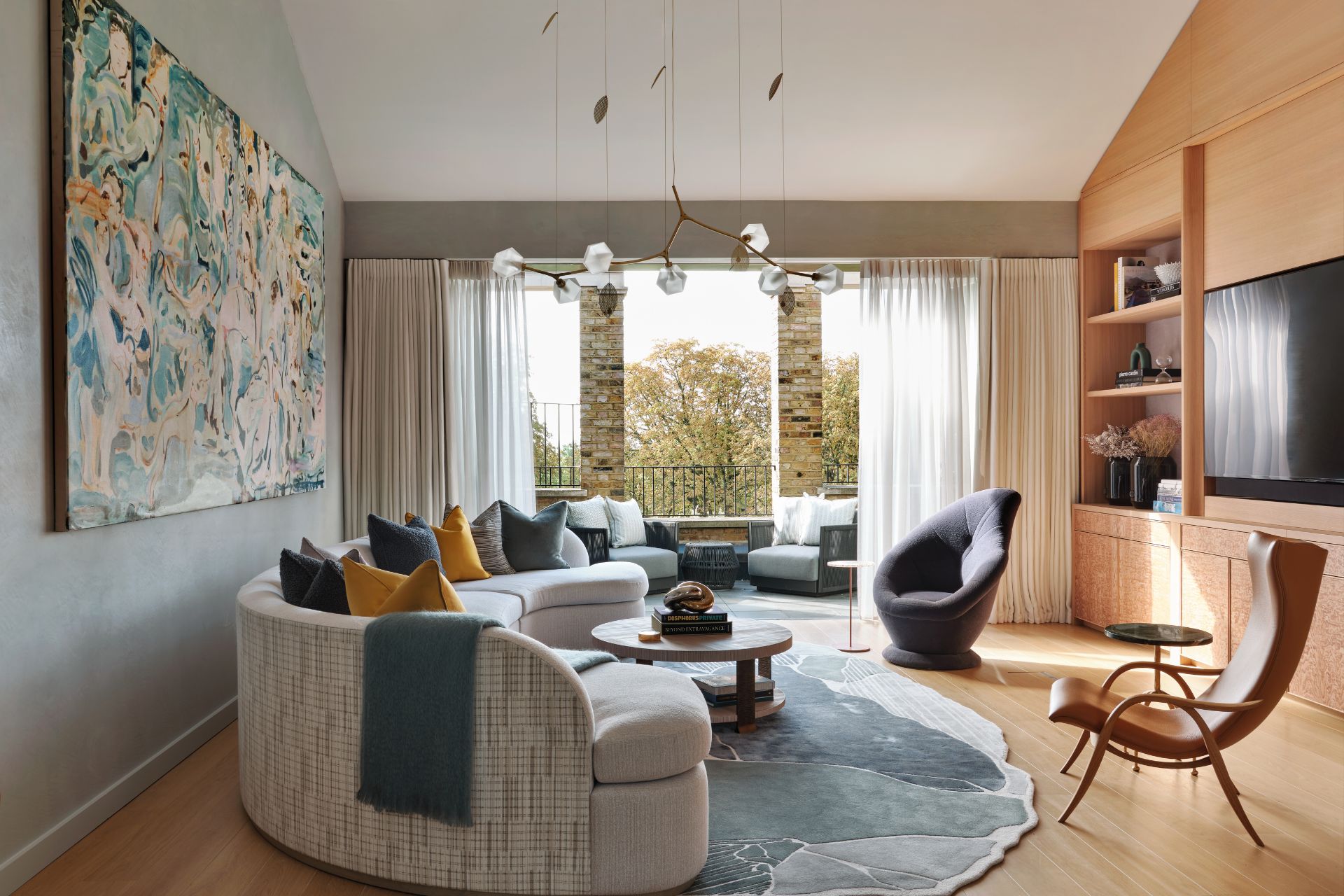
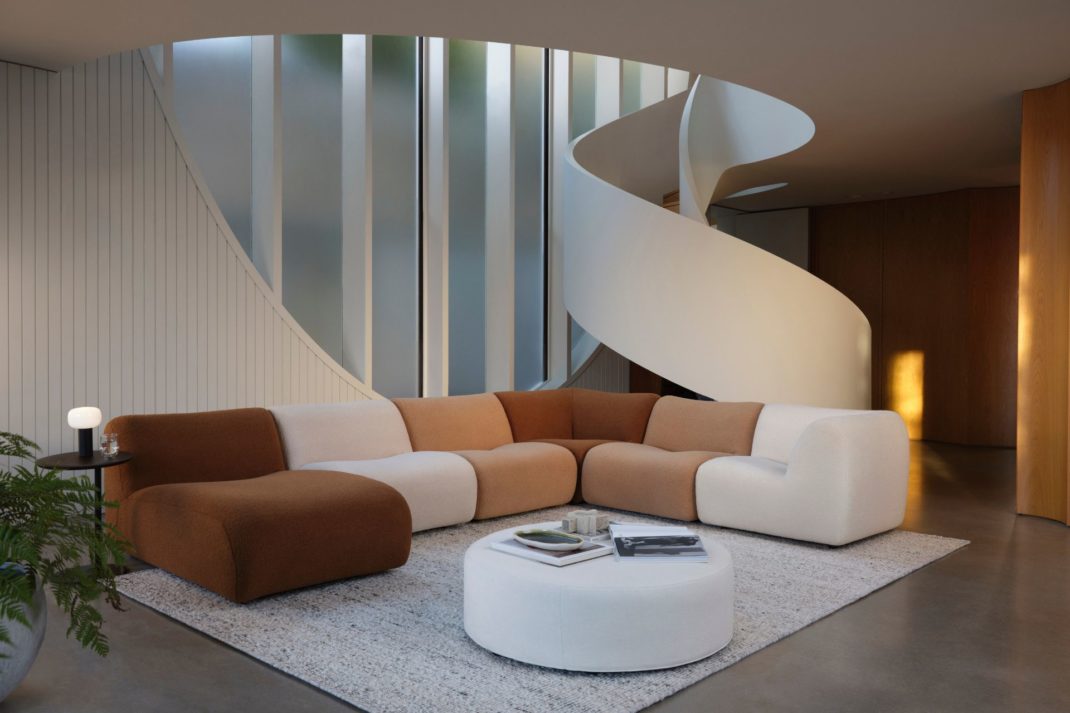
What was the vision for the formal living space?
The client had already furnished this space but wasn’t happy with how the room felt – it was lacking in personality and it wasn’t to their taste. Our challenge was to bring in a real punch of colour to make it a bold and vibrant living space where they could entertain their friends and have fun.
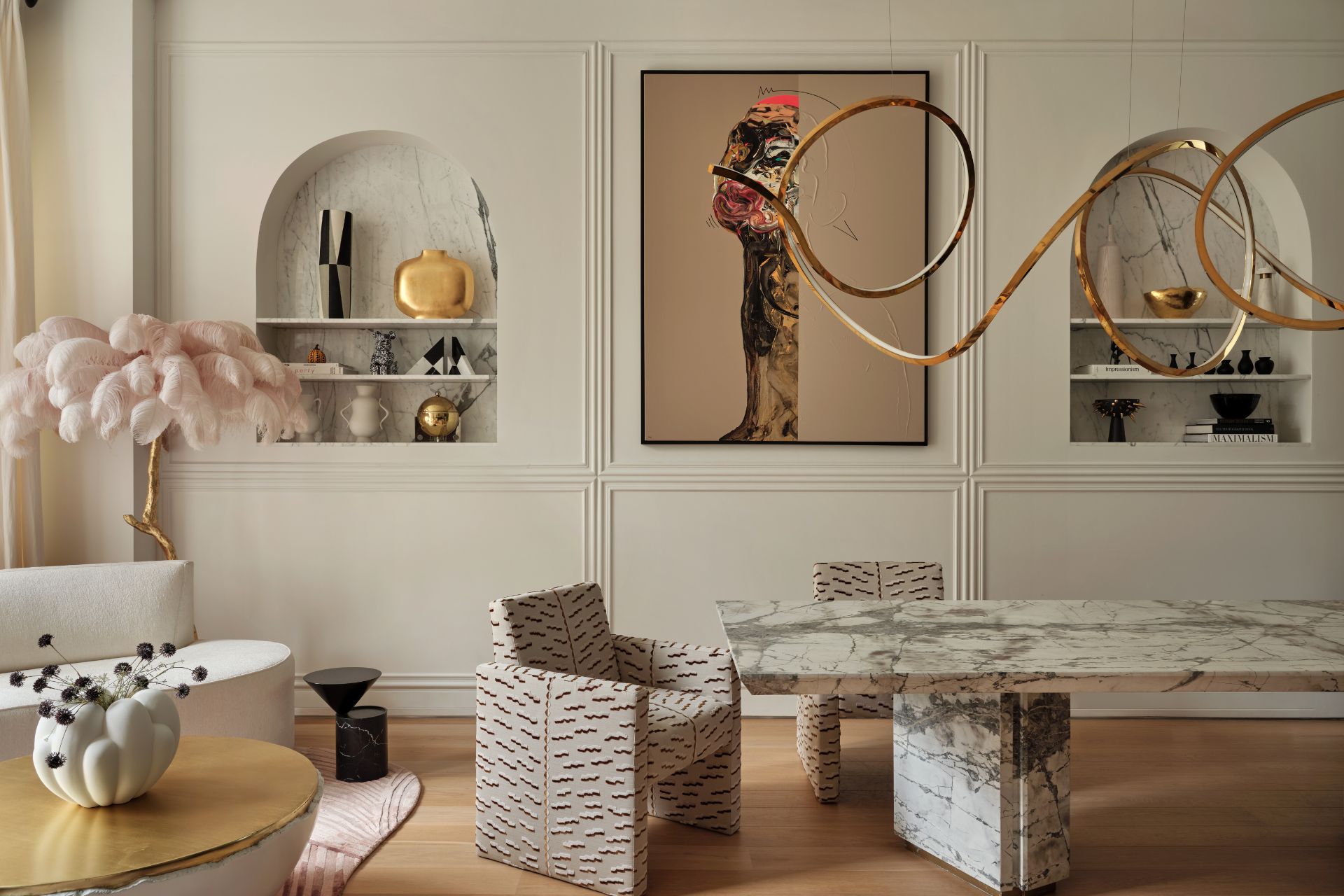
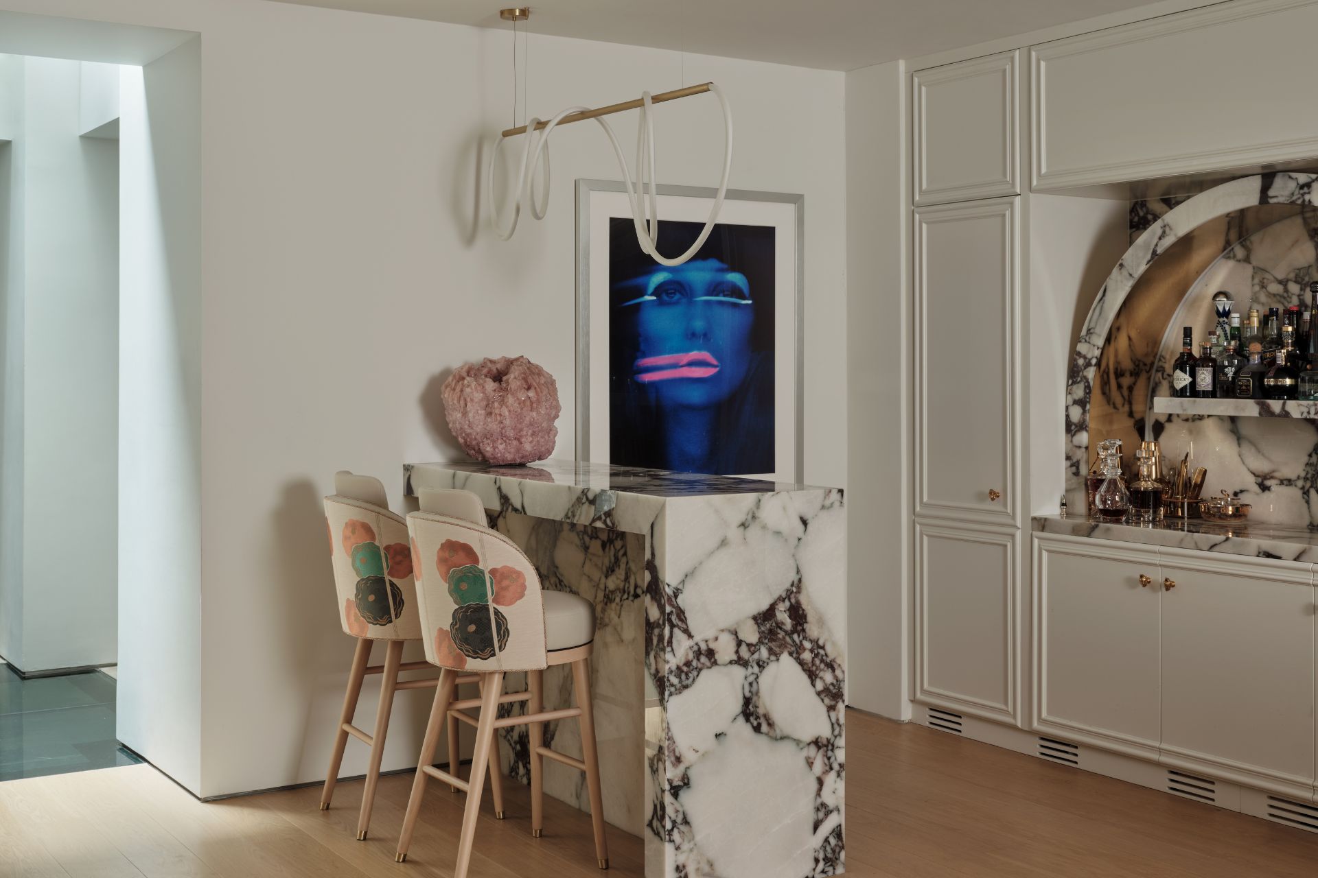
We started by designing an organic-shaped banquette to sit underneath their Tracey Emin neon art in the bar area, framed with a Calacatta viola marble surround. Then, in the living area, a large handmade rug sweeps the space with rich textures and playful patterns. A bespoke curved boucle sofa (which is nearly 5 metres long!) adds to the layered textures in the room, alongside alabaster wall lights by Bert Frank. Floor-to-ceiling doors fill the room with natural light and emphasise its grand proportions.
The large art piece above the sofa is a canvas Emilio Martinez sourced from Chahan Gallery at PAD; it really delivers the injection of colour and fun that was previously missing from the room. Emilio’s mixed-media work reflects his childhood memories and dreams. This painting is a visionary fantasy world with fanged beasts and lurid characters, and the more you look at it the more you see them hiding in the painting – it’s very special.
What about the kitchen?
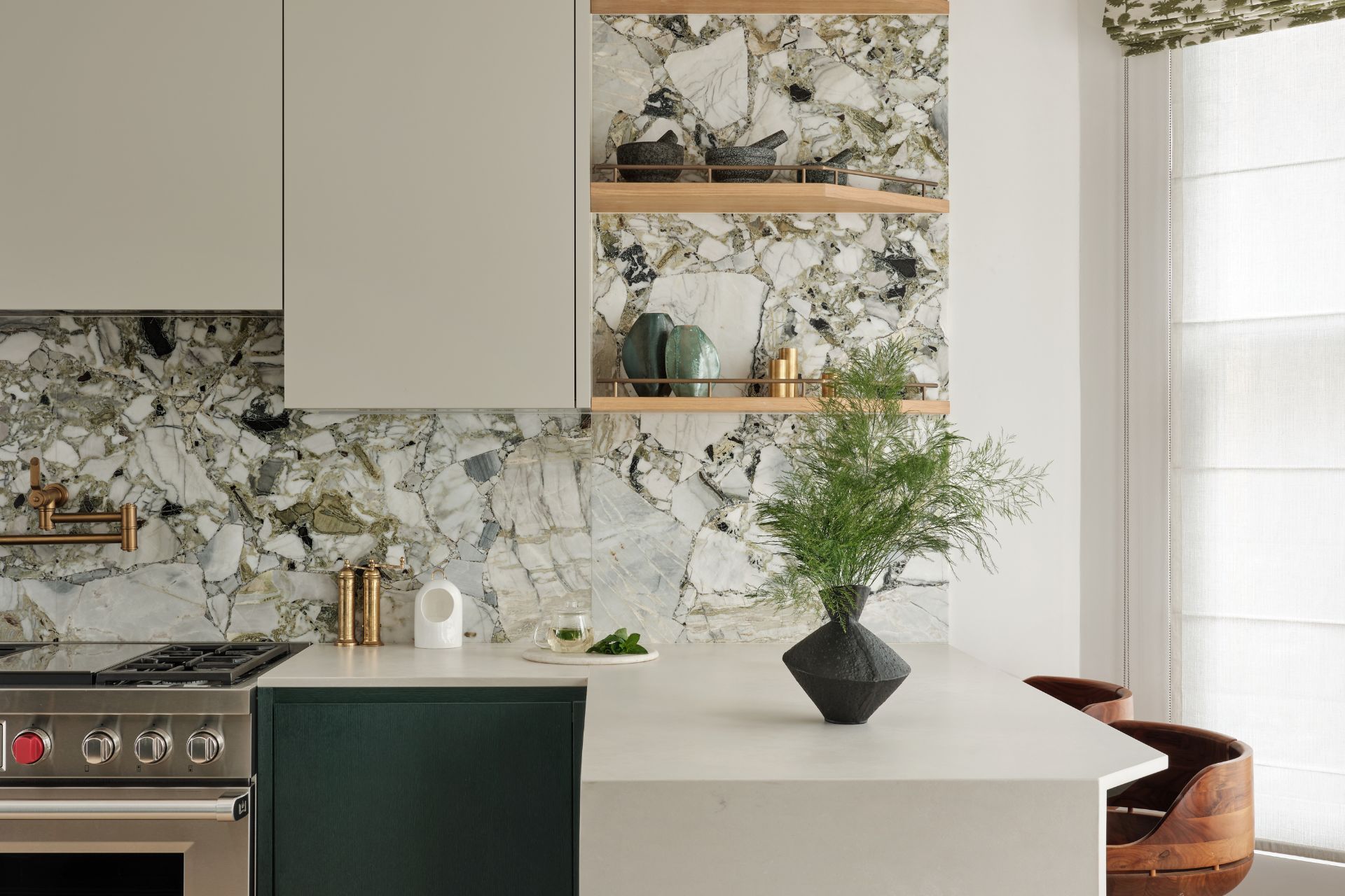
Designed in conjunction with Lanserring, the earthy-toned kitchen is adorned with luxurious marble countertops and dark forest green cabinetry, creating a sophisticated focal point that seamlessly integrates style and practicality. The kitchen is not only a culinary haven but also a gathering place for family and friends.
The vision for the kitchen was to embrace colour and unique materials in an unexpected way whilst maximising practicality through storage and increased surface area for food preparation. White Beauty, a graphic quartzite, was used for the splashbacks throughout, consisting of a mix of black and white tones with hints of both pale and deep green.
Which materials did you work with and why?
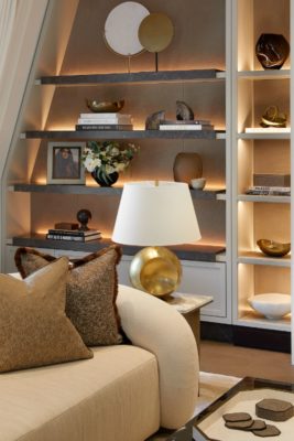
The design team worked with a variety of expressive finishes that create talking points throughout the property, such as figurative marbles in the principal bathroom and kitchen, as well as unusual burr veneers in the entertaining spaces. Exploring layered textures within wallcoverings, fabrics and even rugs gave this family home a sense of depth and personality across all floors.
Were there any challenges on the project? How did you work around these?
The client fell pregnant during the early stages of design work, so we definitely had a hard deadline to get all the building finished and the kitchen fitted in time for her due date. (We ended up installing all the furniture and fittings whilst she was in labour!)
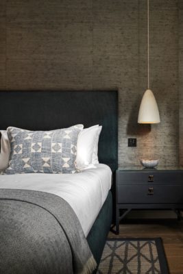
However, we managed to get everything in on time and she came back to a beautiful home with a divine nursery for her new baby girl and the most gorgeous of principal suites to spend that precious time with her newborn.
What’s your favourite part of the end result?
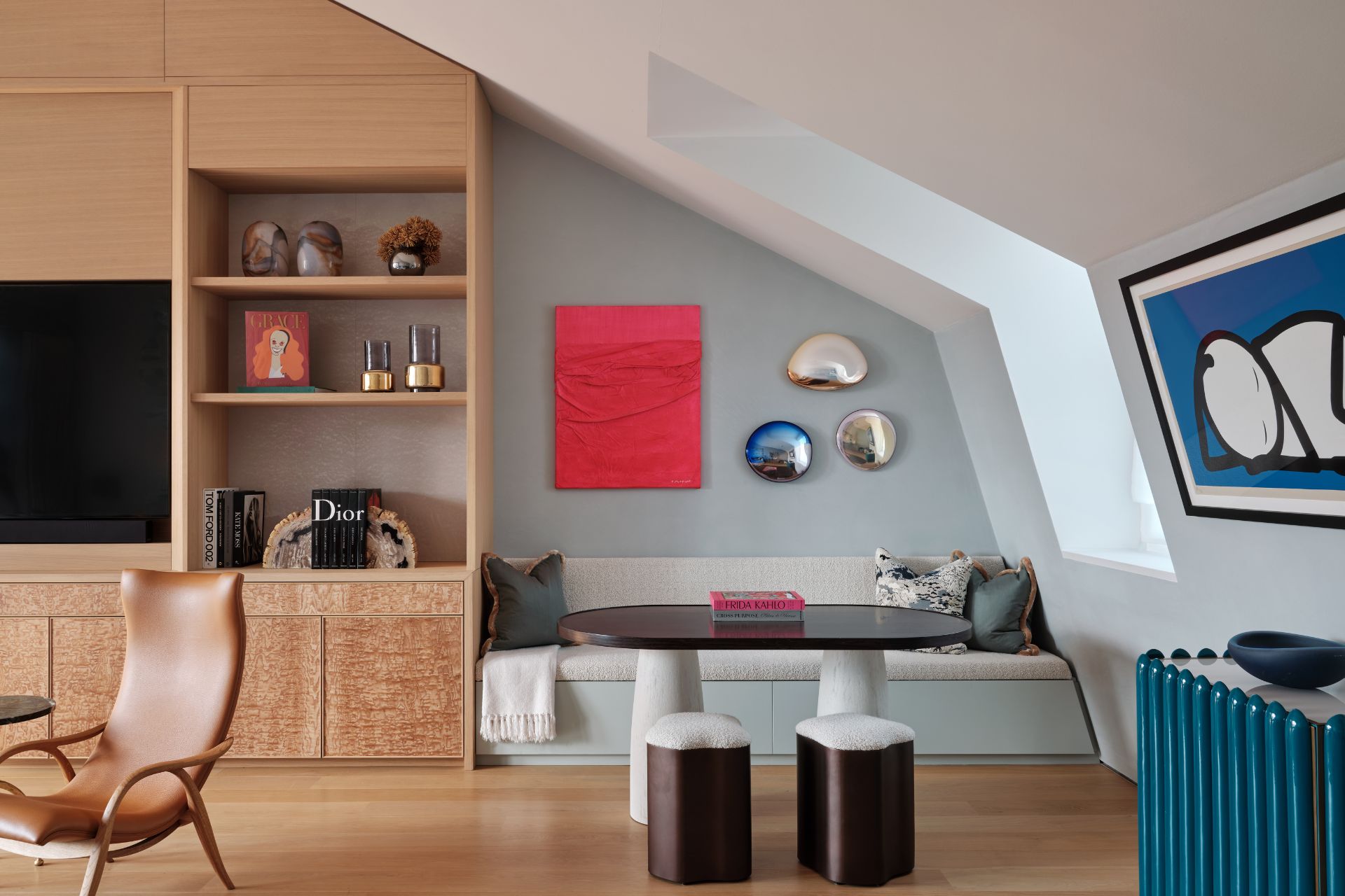
Probably the entertainment room. Set on the sixth floor of the townhouse, it’s a super cool space complete with its own private balcony. We’d describe it as a blend of playful artwork and a rich tapestry of character: a classic Carl Hansen chair sits side-by-side with an iconic vintage Italian 1970s leaf chair from Gallery Glustin, and a bespoke Howes & Landino side table adds to this eclectic mix, featuring rose gold and petals floated in resin. Opposite is a large commissioned Tomo Campbell artwork that was too big to be brought in framed so was instead rolled and stretched on site.
How could readers recreate this at home?
Injecting personality and colour was paramount to this project’s brief, ensuring each space didn’t look or feel overdesigned. The clients also wanted to display artwork in places where it would be most appreciated, which was more important than exactly matching the colour palette of each individual room.
We suggest using a calmer colour palette in the principal suite (in the bathroom, we used just one finish and one stone on the walls, floor and vanity to create a really immersive look) and then going bold in your entertaining areas. Be playful with art and accessories – they add personality!