How To Nail 2025’s Primary Colour Trend
By
3 months ago
Did someone say January blues?
The Christmas decorations might be abandoned, the lights somehow less twinkly, and January once again underway, but it doesn’t all have to be bleak – you might find the perfect antidote in the latest interior design trend: bold primary colours. Think dopamine decor with a touch of whimsy.
The ‘Primary Play’ Interiors Trend: How To Decorate With Primary Colours
Want to kickstart the New Year by bringing a bit of colour into your home? The ‘primary play’ trend is definitely the one for you.
‘2025 is set to be a year of rebellion in interiors: primary colours are back with a twist,’ says Karl Openshaw, Lead Creative at Blocc House of Interiors. ‘Forget the muted, grown-up tones of recent years; this is about embracing the playfulness of life.’
While earthy shades like rich brown and terracotta are set to dominate in 2025, the bold primary colour trend is also gaining traction in the interior design world – and it’s easier to try out than you might think. ‘Red, yellow, and blue are the foundation of all other colours, making them the perfect building blocks for any space,’ Karl explains. ‘Primary colours also pair wonderfully with tints and shades of the same hue. So, red could be paired with pink or maroon, while primary blue marries nicely with a sky or royal blue, and primary yellow can be combined with a cream shade.’
Wondering where to start with these eye-catching hues? Here’s a quick guide.
Red
View this post on Instagram
If you’re ready to move away from minimalism and embrace joy through colour, take a dash of inspiration from the unexpected red trend, which is all about ‘injecting a jolt of energy in unconventional places,’ says Karl. ‘Picture a striking red door frame, a vibrant chair, or a crimson backsplash in a minimalist kitchen. The colour may be bold, but it doesn’t have to dominate.’
Of course, colour drenching is always an option if you’re feeling adventurous, but for a different starting point, ‘consider an accent wall, or introduce a touch of colour to the space by painting a beam, window frame, or the inside of a cupboard,’ Karl notes.
Think about texture, too: ‘Experimenting with different textures alongside your primary colour scheme creates dimension,’ Karl continues. ‘An emerging trend is the use of textured paint to add depth to walls by creating variations in light and shadow. This effect can lift a room and make it feel livelier.’
Blue
View this post on Instagram
Dusky blue and rich navy might once have been all the rage, but the latest trending shade is ‘cosmic cobalt’.
‘If you’re looking to create a sense of calm with a touch of mystery, this is the shade for you,’ explains Karl. ‘Incorporate it into an accent wall or go bold with a velvet cobalt sofa or striking art pieces. It’s a shade that feels both modern and timeless, blending into contemporary and classic interiors alike.’
To really nail a blue room, think about functionality. ‘Consider the purpose of your room and the emotional response that certain colours can elicit,’ Karl states. ‘While bright yellow is a great choice for an energetic, communal space like a kitchen, for example, blue might be better in a home office, where you want to stimulate motivation and productivity.’
Yellow
View this post on Instagram
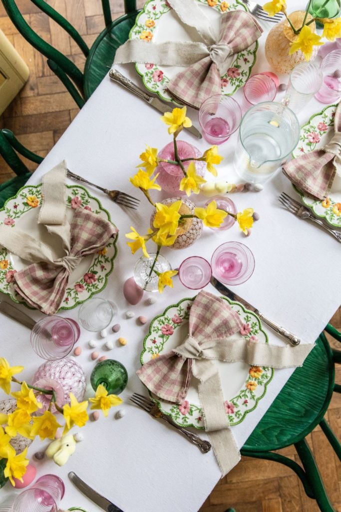
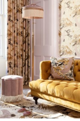
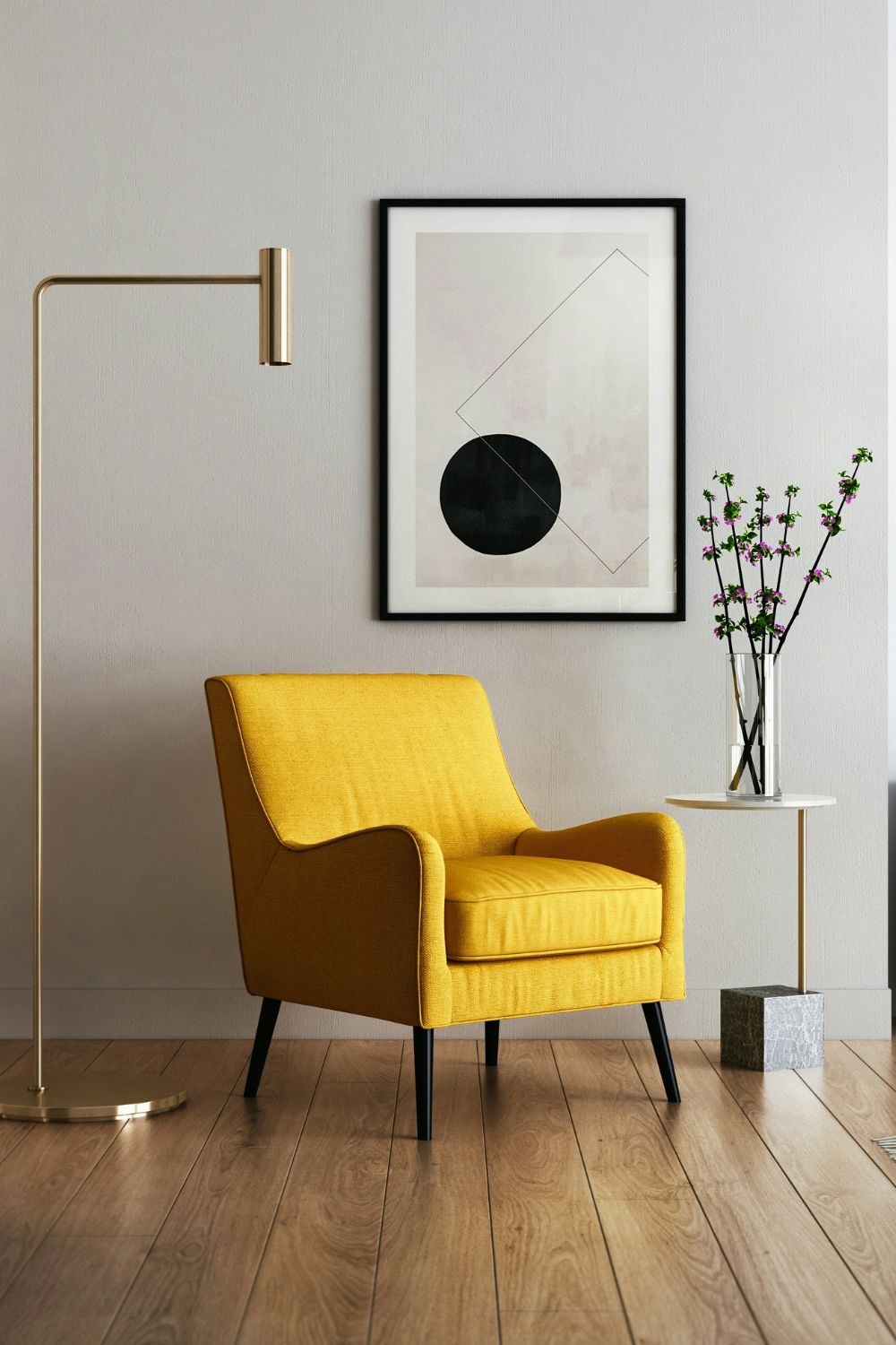
Finally, for a truly uplifting space, there’s ‘energising yellow’. ‘It’s all about optimism; it’s the burst of sunshine we need in our homes,’ says Karl. (There’s no better way to bring some warmth into your space during the long winter months, after all.)
‘Yellow is perfect for kitchens, playrooms, or any area where energy and happiness should take centre stage. Think of it as an instant dopamine hit for your interiors,’ Karl reflects.

