What Does Pantone’s Very Peri Say About 2022?
By
3 years ago
Very Peri speaks to our digital lives, but it's also one that's steeped in ancient symbolism

What’s the symbolism behind Pantone’s Very Peri?
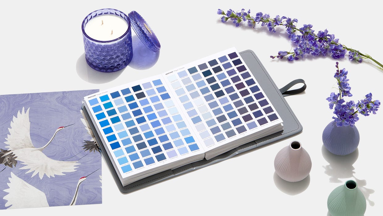
Every year Pantone picks a colour of the year that symbolises the year ahead. For 2022, the colour is: ‘Very Peri’. According to Pantone, it’s all about ‘personal inventiveness’, ‘creativity’, and how merged our physical and digital lives have become. We analyse why the colour is such a zeitgeist hue today, and what historical symbols lie behind it.
View this post on Instagram
Very Peri is a hue that’s rarely seen in nature. It’s no coincidence: this colour is all about invoking the digital age of 2022. We’ve already seen it peppered across the digital landscape: think Olivia Rodrigo’s hit album, Sour, or Apple’s purple range released this year. It’s a colour that speaks of digital creators and virtual reality landscapes that have dominated our world during the pandemic. Doja Cat invoked this futuristic whimsical hue too in her hit music video, Kiss Me More, set in a gamified digital utopian-style landscape of a man rowing a canoe through a river.
View this post on Instagram
Pantone cites the metaverse, trends in gaming and the rising artistic communities in the digital spaces as cues – and it’s not hard to see why. This year we’ve seen the rise of NFTs (non-fungible tokens) – that’s shaken up how we understand creativity, and if it even needs to be tangible to be a credible piece of art. Remember Beeple’s, ‘Everyday: The First 5,000 Days’? It was the NFT that sold for a record-breaking $69 million at Christie’s, which was the first NFT ever to be sold at the auction house. We’ve seen Facebook change its name to Meta to signal its shift to investing in the metaverse, and we’ve also seen TikTok’s popularity rocket; becoming the most downloaded app in the world in the first quarter of 2020.
It’s clear that the colour is one that comments on the digital age, but it’s actually one that’s steeped with symbolism throughout history. Purple has long been a symbolic colour of royalty – both in the church and the secular world. It was used for ostentatious splendour in spiritual ceremonies: in Ancient Greece, purple was the colour of choice for honouring the dead and the fearsome gods of the underworld. The Romans saw the colour to represent worldly power – making it no surprise it was worn exclusively worn by the rich and powerful, where it was actually made law that only Caesars could wear the colour. Outside Europe, Chinese Emperors, and the Aztecs and Incas in the Americas invoked the colour similarly to display royalty and divinity.
View this post on Instagram
Outside history: the colour has also been understood to indicate balance, as it’s a mixture of the two primary colours: red and blue. It’s said that brings opposites together: the passion of red, offset by the blue of reason. If you’re thinking of restoring a symbolic element of balance to your home with Very Peri, Pantone suggests you look to complement it with colours such as their Granite Green – a soft, light sage green kind of colour, or their Dried Moss, which is a pastel earthy light yellow.
SEE MORE
Easy Ways to Brighten up your Home / Wallpaper Ideas for Every Room / Paint
Main image: Pantone


